Have you all heard of guerrilla marketing? According to Google the Great and Powerful, the technical definition of guerrilla marketing is this:
"Guerrilla Marketing, noun
1. Innovative, unconventional, and low-cost marketing techniques aimed at obtaining maximum exposure for a product."
Pretty cool, huh? But very few companies actually take the time and summon up the creativity to pull off one of these marketing campaigns. Guerrilla marketing can be not only a great way to drum up buzz and word-of-mouth advertising, but it can be another avenue for solidifying your brand image. If you're confused about what branding entails, check out our first blog post breaking it down. One of our favorite guerrilla marketing techniques is using vinyl clings, stickers, decals, and wraps to put the brand on everyday objects. Let's look at some examples of companies who've done great campaigns using vinyl decals:
1. jobsintown.de: These guerrilla vinyl wraps make up what is probably my favorite marketing campaign of all time. jobsintown.de is a German job-finding website whose slogan is "Life's too short for the wrong job." Scholz & Friends (one of the biggest ad agencies in Europe) came up with the concept and the campaign. They wrapped images on commonplace objects like arcade video games, gas station pumps, airport security belts, washing machines and more that made it appear as if a person were crammed inside the machine making it work.
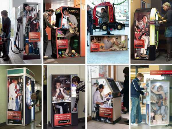
Which one is your favorite? I love them all, but it's a toss up between the weary Mario puppeteer and the coin roller giving customers the stink eye.
This is a great guerrilla campaign! They knew from a Gallup poll that 13% of Germans were unsatisfied with their jobs. By portraying the perfect "I hate my job" imagery, they were able to increase visits to jobsintown.de by 25% in one year. Pretty impressive for a single campaign! Not to mention, they were able to use vending and other machines that already existed and simply pay for the design, installation, and ad space—probably equitable to what the same number of billboards would cost but way more attention grabbing and whimsical.
2. Pedigree: This pet food and supply company did a great job of targeting their clients. Pedigree placed vinyl stickers that looked (and even smelled) like dog food in a bowl outside of pet stores. Gullible dogs would get excited and pull their owners over to what they thought was a heaping bowl of kibble. Dogs licked, snuffled, and wagged their tails so their owners would think that Pedigree food made their dog happy before they entered the pet store where it was sold.
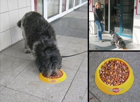
Aw, poor puppy! He thought he was getting free food :)
This was a pretty ingenious idea. They were able to target customers directly where they could buy their product, and at little marketing cost. A very simple, but very effective, method.
3. Lay's: Everyone loves potato chips, but not everyone thinks of them as a "natural" food. To combat the idea that potato chips are junk food made with fake ingredients, Lay's put a vinyl installation on the ceiling of Chicago's Jackson Tunnel with an accompanying sign sporting the tag-line "Our potatoes are grown closer than you may think."
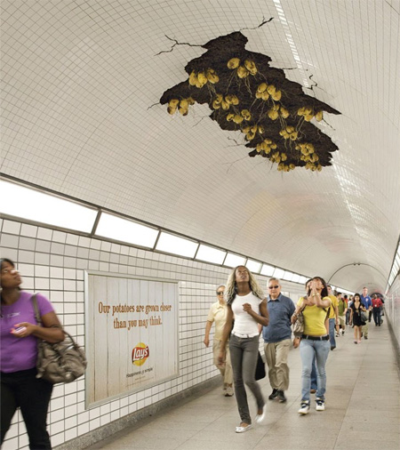
This one is definitely turning heads!
This is a pretty eye-catching ambient ad! The only thing that might have made it better would be if the tag-line were on the ceiling as well. People are so distracted by what appears to be potatoes growing over their heads that they might miss the sign on the wall, and therefore the whole point of grabbing their attention.
4. Le Cactus Restaurant: This French Canadian restaurant and bar wanted to draw more people into their establishment for "Monday Hot Wings." They did a very clever and simple (have you noticed that the best ones are the simple ones?) advertisment that showed off the volcanic effects of hot wings. They had vinyl decals made of a man wincing (or possibly screaming?) and placed them over the rear window of taxis so the break light would make the man's tongue appear to be glowing red. Red hot from hot wings!
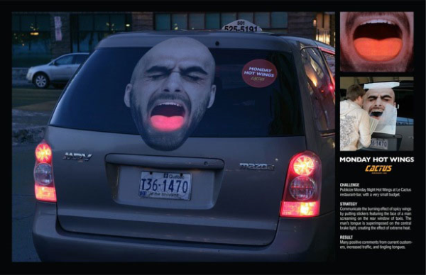
Because they speak French, is he screaming "Aaaaaah" or "Aiiiiiiieee"?
Using taxis was a great idea on their part because taxis travel all over town and get a really wide and varied reach when it comes to creating marketing impressions. The campaign was a success with plenty of positive comments from current customers, increased traffic, and even more "burning tongues."
5. Frontline: This ad was created by global advertising group Saatchi & Saatchi in Jakarta, Indonesia for a pet emporium called JAKPETS. The giant floor mural was placed in a mall in Jakarta to encourage dog owners to buy Frontline flea and tick spray.
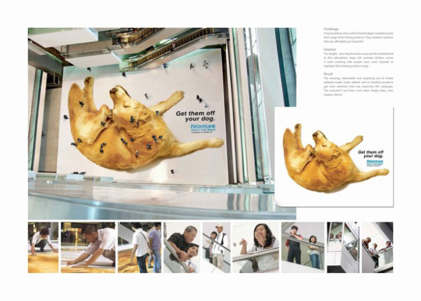
Ew! People-fleas!
This ad cleverly used the people in the mall as part of the message. Looking down from the upper levels, the people on the ground floor looked like bugs making the dog itch! Any time you can get people involved in the ad itself it's great because it makes it much more likely to be talked about and shared by those who experience it.
6. Feed South Africa: Even charities and non-profits need to advertise! This ad by TBWA\Hunt\Lascaris tugged on heartstrings of South African grocery shoppers by both alerting them to the problem of hungry children in South Africa and showing them how easy it is to donate to the Feed South Africa fund.
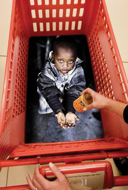
It's especially important for charities and non-profit organizations to have good advertising campaigns because it can be more challenging to get consumers to donate than it can be to get them to buy something.
They did a good job on choosing very moving images and making it simple to get information. The sticker on the handle of the cart says "See how easy feeding the hungry can be?" and includes a URL to the charity's website. Using such a strong emotional appeal can be extremely effective! I don't think I could resist donating after experiencing this ad at the grocery store.
7. Wilkinson Quattro Titanium: This one is pretty crazy. The Wilkinson razor company printed masculine faces on small transparent stickers that they then stuck on eggs that were being sold in Brussels' grocery stores. The eggs all had faces and there was a small flyer stuck in each carton saying "every man deserves smooth skin."
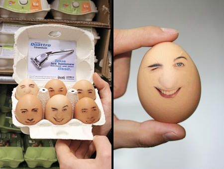
I don't know how I feel about an egg that looks like he's asking me if I "come here often."
This one would take a lot of effort and involvement of other parties, so it's not as ideal as some of the others we've listed. Also, some people might worry about the health of eating eggs that had something with printed ink on the shell. (I'd feel guilty about cracking the faces!) But there's no denying that this was a "fresh" and unique way to create buzz and brand recognition!
8. Walt Disney Pictures (Alice in Wonderland): Is it any surprise that the company that prides itself on innovation and owning "the most magical place on earth" is on this list? This ambient ceiling mural was created by AUGE in Milan and placed on a glass dome in a shopping mall in Rome. The giant image of Alice from Alice in Wonderland peering down on shoppers makes it appear as if they all "fell down the rabbit hole."
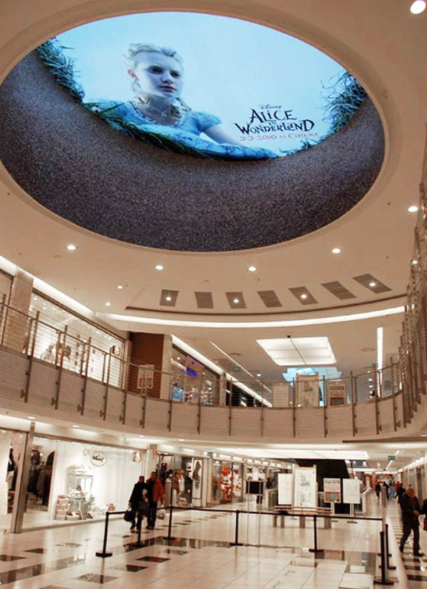 This mural was a great way for Disney to grab attention while staying on brand with the magic of the company and with the surrealism of the movie.
9. Elmex Toothpaste: This toothpaste company has a history of fun and successful guerrilla marketing campaigns involving vinyl graphics. One of the campaigns was called "Cavities in my Locker" and involved graphics in the most popular fitness clubs in Israel. The lockers were covered with graphics so they looked like a set of teeth. Opening one of the lockers made it seem as if there was a hole in the teeth. Inside each locker was a small sample of the toothpaste and more information on dental hygiene. This campaign exposed the brand to 35,000–40,000 people in one month!
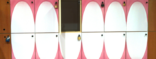
Smile! You're about to get a free sample of toothpaste!
Elmex also did a similar campaign with bowling balls in the most popular bowling alleys in the country. They filtered 140 bowling balls with no holes into the lanes with regular bowling balls. Instead of three finger holes, the Elmex bowling balls had three stickers that said "Elmex," "Helps prevent," "cavities."
10. Doom Bug Spray: This campaign was made by the same advertising company that did the "Feed South Africa" campaign. Doom's "Welcome to Roachville" campaign was also based in Johannesburg. The idea they wanted to promote was that the Doom fogger spray was so effective and pervasive that it could reach roaches in the tiniest of nooks and crannies "where they live."
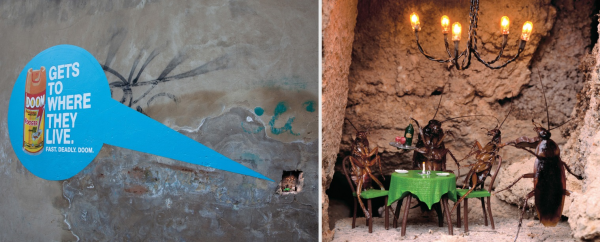
This particular diorama is called "The Café"
They found little chunks and crevices in city walls and created tiny anthropomorphous cockroaches in people-like scenarios. They then placed brightly colored circles with the product and slogan pointing out the miniature "roachvilles" to passersby.
So, what do you think? Are guerrilla campaigns cool or are they too invasive? What do you think about ads becoming part of everyday objects? Leave a comment below!
Interested in getting your own ambient ads made? Contact us today for a free quote and consultation on digital printing and cut graphics!


Leave a Reply