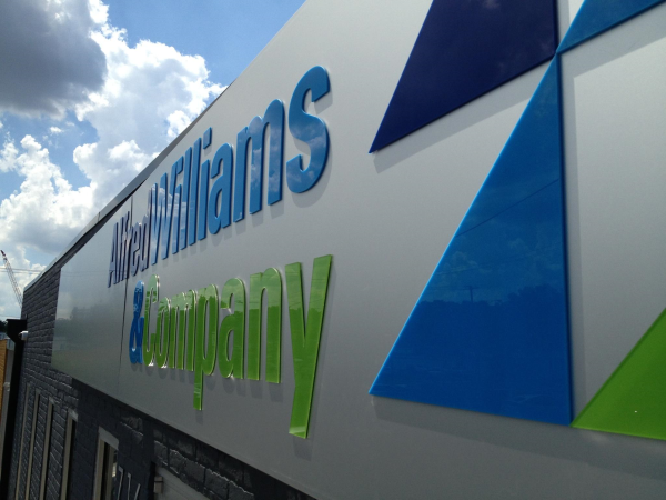
This was done a while ago but we're still really proud of the acrylic lettering and vinyl logos we did for Alfred Williams & Co.!

Great color combination on Alfred Williams & Co.'s part! The analogous color palate looks modern and cool without being too splashy or overpowering.
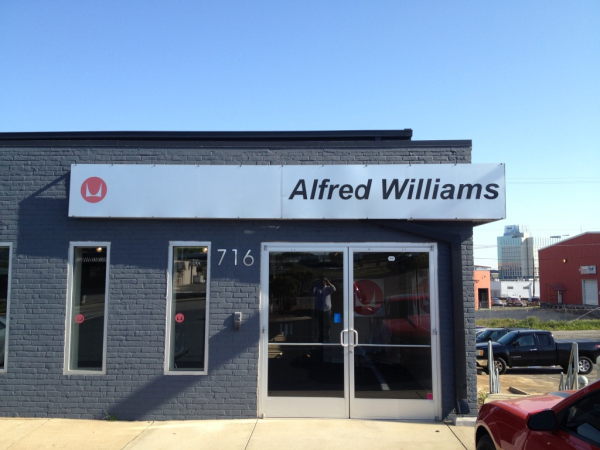
When we first spoke with Alfred Williams & Company we learned that they really wanted to update their look from what it had been. Our main concern would be to produce signage that fit with their high-end reputation while staying on budget. We felt like we accomplished this goal and are pleased with the end result! Here's a picture of what it looked like before:

Before
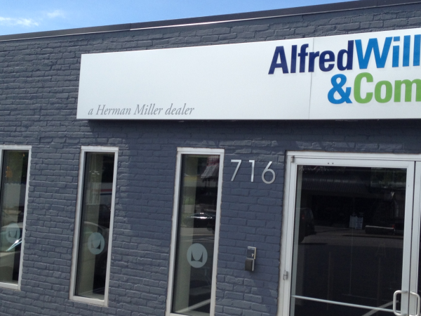
 Done!
Done!
To improve the look of the aluminum awning where the logo would be posted, all of the bolt heads were removed. The bolt heads detracted from the sleekness of the metal and created some warping and puckering in the aluminum sheet. As a solution, the whole thing was "re-skinned" with new aluminum by creating a sort of "shoe box lid" that fit nicely over the old structure. The edges were ground down a little, and the whole awning was optimized to be as seamless and clean-looking as possible.
On top of the aluminum awning we used acrylic laser cut lettering and a similarly toned vinyl logo. Using a gray vinyl for the logo created a neat effect that made the logo stand out in certain angles and blend into the metal at others. The shimmering effect this creates will hopefully attract the eyes of customers and passersby.
The blue colors they wanted to use are standard acrylic colors we already had on hand, but we had to create the green ourselves! There are two ways to custom color acrylic: you can paint clear acrylic, or you can use vinyl. We chose to back clear acrylic with green vinyl because it would keep the acrylic just as glossy looking as the other acrylic pieces whereas painting acrylic will often make it look matte and textured. This helped the letters have that reflective, almost wet, look.
In addition to the aluminum awning we also replaced their smaller red window vinyls with larger frosted etch window logo decals. This echoed the gray logo on the awning and fit their new feel and color scheme much better.
We love getting to work on rebranding projects like this! It gives us a chance to branch out creatively and to help other businesses fine-tune their image. It was a particular pleasure to work with Alfred Williams & Co.—a company that is exceptionally professional and well-respected. It was challenging but fun and made us rise to the occasion!
Looking to get a sign for your office or business? Contact the experts at 12-Point SignWorks and get a free quote today!


Leave a Reply