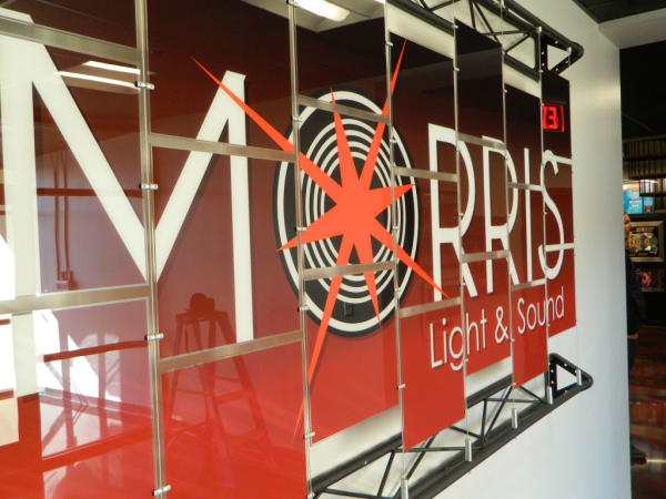
Morris Light and Sound is a big name in the entertainment business here in Nashville that specializes in stadium-sized productions, so we wanted to make them a larger-than life sign to match their larger-than-life services. Morris Light and sound runs and installs lighting and sound equipment for the likes of huge artists, touring shows, large media events (like the CMA Festival), The Tennessee Titan's stadium, as well as any other media or corporate event, including trade shows.
They approached us because they had seen our website and knew that we could give them an outside-of-the-box, highly creative sign to complement their company image. Together, we decided that making their logo sign into an architectural display would be an awesome way to do just that!

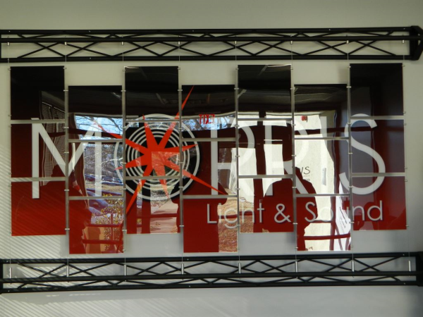
They gave us the logo art and we plotted and printed it on a gradient background.
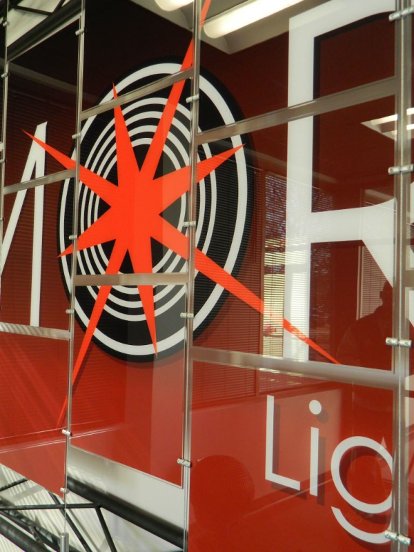
In case you don't know much about architectural display systems, check out our blog post "Why Architectural Display Systems are Totally Rad" to find out more. Basically they are displays comprised of any combination of cables and bolts that usually hold up acrylic or glass panels. For this particular sign, we used clear, layered acrylic panels, toggle bolts, and cables from Albion. The cool thing about using acrylic panels like this is that we can replace this logo design with a completely different design with unbelievable ease. Just print a new design, slide the old design out, slide the new design in, and presto! You've got yourself a completely fresh display.

The red burst coming out of what could either be a can light or a speaker is kind of hypnotic, don't you think?
We attached the cables to trusses, provided by Morris Light and Sound, because they represent a large part of what the company does. If you've ever worked backstage at a stadium or theater, then you know that trusses are the Christmas trees where the techies hang all of the lights and other fun electrical equipment.
The sign itself is made up of eight cable systems and twenty-one acrylic panels, attached to two trusses. The trusses are attached to the wall by toggle bolts. We drilled through the truss and then a little bit into the wall to firmly attach the metal frame using six bolts a piece.
 Pow! We love the way the 'O' in 'Morris' could either respresent a burst of sound or a burst of light. It's a super creative way to show off both of their services in one icon.
We were given the logo art but were asked to design the background. We tried a few different approaches to how the whole sign should look—ranging from fairly intricate design to this simple gradient. In the end, the company decided to go for the simple gradient, letting their logo (literally) be the spotlight.
Thank you to everyone at Morris Light and Sound for letting us work on this cool project with you! Architectural displays usually end up being some of our favorite projects :)
Interested in getting a display system for your business? Call us today or click the button below to learn more and contact us with any questions!


Leave a Reply