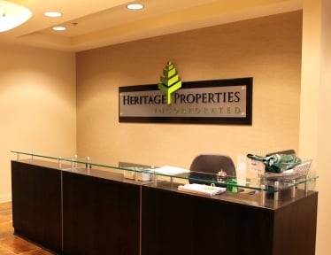
Have you ever thought about what your office or reception area would look like with a new custom sign? For any business, having a new custom lobby sign can make the whole room more attractive. Here's a great example of how one business enhanced their reception area with a new custom lobby sign from 12-Point SignWorks.

First things first: the designers at 12-Point SignWorks consulted with Heritage Properties about the new office sign design, taking note of the sleek environment already existing in the office. They wanted to create a sign that would not only reflect the themes in their business area, but also draw customers and attract potential clients through custom business signage.
The reception desk was a beautiful rich mahogany color with a glass top. For the base of the sign, we used a paint of the same hue and a sheet of clear acrylic on metal standoffs to give the sign the same effect as the desk.


Black dimensional acrylic letters were used for the company title, and a light green hue was used for the subtitle, "Incorporated," in order to focus attention on the actual title. The dark letters on the clear acrylic really stand out!
Finally, there was the "tree", which was probably the most complicated part of this custom sign design. Several metal standoffs were used for each "branch" to ensure stability and longevity. We painted one half dark green and one half light green to add to the 3D effect of the whole sign. It turned out great!


Once the sign was installed on the wall behind the desk, the whole reception area was complete. This sign not only adds a beautiful modern touch to the room, and it also informs and impresses potential clients that visit. We certainly enjoyed the opportunity to create this custom lobby sign for Heritage Properties!
(Photos taken by Leigh Anne Blakeney Adams of Heritage Properties)


