Custom signs are one of the most effective ways to get people to notice your business or organization. But how do you ensure your signs stand out from the rest? Here are four design considerations to help you get the most from your custom signs.
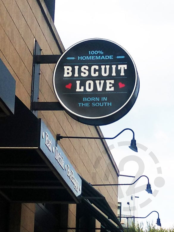
 Biscuit Love's custom lighted sign definitely stands out in the Gulch area of Nashville, TN!
1. Less is More
Signage should be designed with brevity in mind. Most outdoor signs are only viewed for a few seconds, so it’s important to display only the most important information.
Also, consider how your sign will be used. Will it be it a logo sign to identify the location of your business (like the one pictured above)? Or will it need to include more, such as your contact information or hours of operation? If more text is required, be sure to keep the text brief and include adequate space between elements.
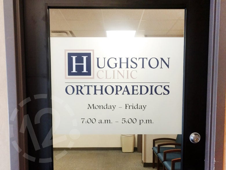
 Windows and doors offer another great opportunity for signage. Notice the days and hours of operation included in this window graphic.
2. Legibility Matters
The font selection and size of text in your signage are also very important. We suggest that you use no more than three fonts in a sign and select fonts that have clean lines and are easy to read. Also, consider legibility when standing at a distance. Will the text be large enough to read quickly as a person is driving or walking by?
3. Add a Pop of Color
Color can make a big impact! One or two bold colors can really pop against very dark or very light backgrounds. The goal is to select colors that create a nice contrast. You may also want to include your brand colors when possible for brand recognition.
Also, consider the location where the sign will be placed. Will the colors help the sign stand out from its surroundings?
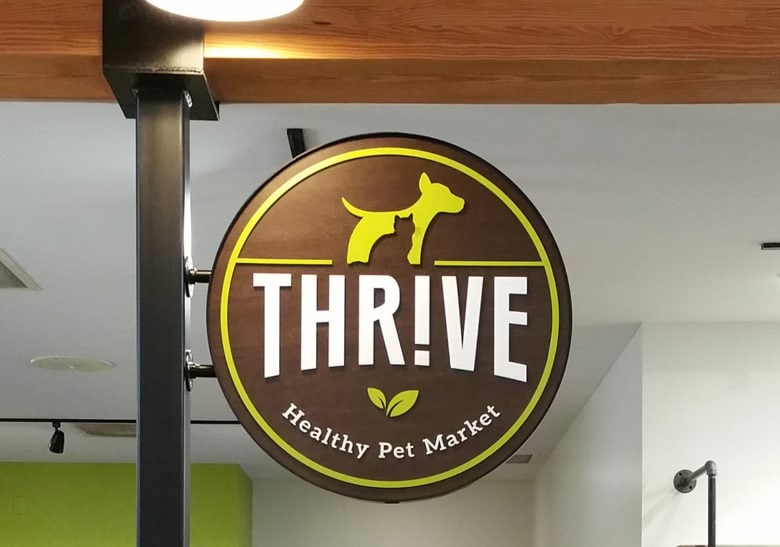
 We love the colors used in this very cool dimensional sign for Thrive Healthy Pet Market in Franklin, TN.
4. Add Photographic Images or Graphics For Visual Interest
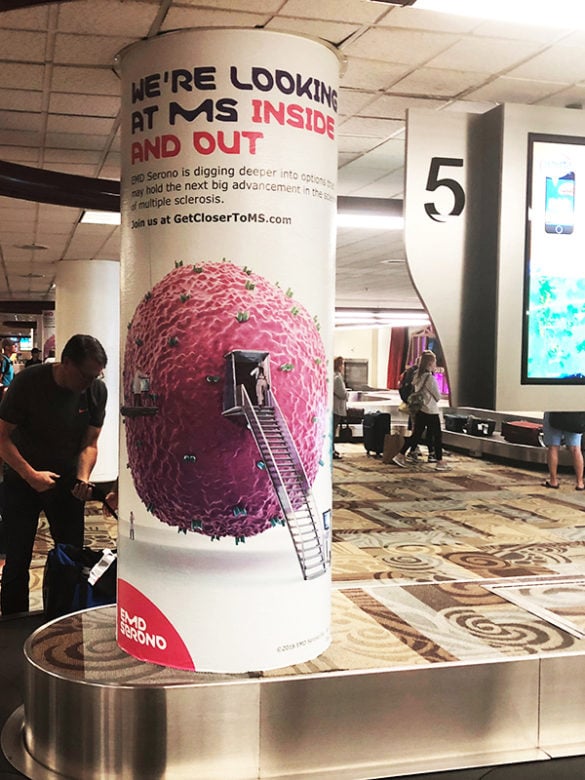
People are generally visual in nature, so graphics and photos definitely help draw interest. Just be careful not to go overboard and lose the intended message. The image in the airport column wrap below definitely grabs attention!
 Check out this photo of a scientist climbing into a cell. Now that's a cool way to get noticed!
Our designers have the talent and experience to design and fabricate custom signage that will work for your business. Whether you need to keep your signage elegant and understated, or you want to go big and bold, we can help!
Give us a call at (615) 595-6564 or click on the button below. We look forward to working with you!
We’re a sign company in Franklin, TN that works hard every day to develop great relationships with our customers! We serve Middle Tennessee, Alabama, and Kentucky and also ship our custom products to customers throughout the US and Canada.
We specialize in environmental branding, vehicle advertising wraps, lobby and logo signs, wall murals, window graphics, architectural displays, event signage, trade show displays, and custom projects.


Leave a Reply