Do you own or manage a large building with multiple tenants? Or do you need to prominently display a list of staff members who work in your office? Well designed directory signs not only provide direction or staff information, but can also make your guests feel welcome in their surroundings. Here are some things we consider when designing directory signs for our customers.
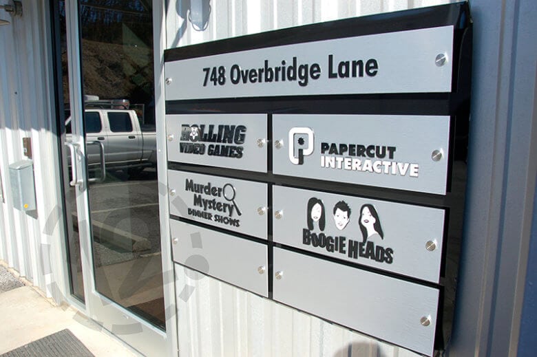 We fabricated this striking directory sign using acrylic, brushed metal and standoffs. The logos are a nice addition!
1. Overall Size
Depending on where your directory sign will be installed, it’s important to consider the overall size of the sign, as well as the font size and graphics. If the majority of visitors will view your sign from the road, you need to ensure that the text is large and legible from a distance. For walk-up directory signs (or signs next to elevators), a smaller font size should be adequate.
2. Materials
We use a variety of materials to fabricate office and directory signs, including acrylic, aluminum, vinyl, PVC and more. We work with our customers to recommend the materials that will work best for the location where the sign will be installed (inside or outside).
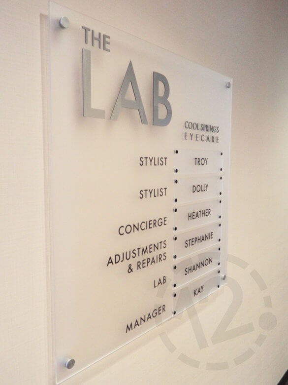 This is a great example of a staff directory. The name plates are attached with magnets, which makes them easily interchangeable.
3. Font & Legibility
When selecting a font for your directory signs, we suggest sans-serif. It’s easier to read from any distance. Also, be sure to double and triple check spelling! Misspellings can leave the wrong impression, and maybe even cause confusion.
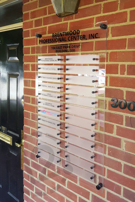 We created this directory sign for Brentwood Professional Center, which contains private offices for businesses to lease.
4. Flexible Design
Directory signs should also be fabricated with flexibility in mind. Tenants will come and go and people will move frequently to new office locations. So an adjustable design is important.
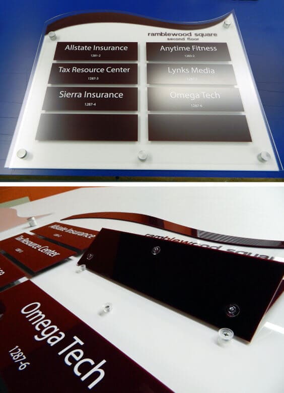 The nameplates in this directory sign were fabricated to be easily interchanged.
5. Branding & Color
When considering the overall look of your sign, you should select materials that complement the building and its surroundings. Interior directory signs should match the building’s decor.
If your directory sign will be used to show office locations for one single business, then you should also consider adding branding (like your company logo) and brand colors. This is a great way to reinforce your brand!
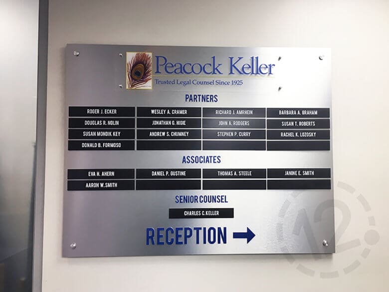 There's no mistaking where you are with this sign. It works double duty as a directory and logo sign all in one!
As you can see, directory signs play an important role in guiding your customers and helping them feel welcome. Let us create a beautiful directory sign for you that will make a great first impression!
In addition to directory signs, we also create temporary and permanent wayfinding signage that can help your visitors navigate large buildings or campuses. To learn more, read this article: How Custom Directional Signage Can Keep Your Visitors Moving.
When you’re ready to create your directional signage, give us a call at (615) 595-6564 or click on the button below.
We also specialize in vehicle advertising wraps, lobby & logo signs, window graphics, wall murals, architectural signage, plaques and custom projects. We serve all of Middle Tennessee, including Nashville, Franklin, Brentwood, La Vergne, Hendersonville, Lebanon, Spring Hill, Murfreesboro, and Columbia. We look forward to hearing from you!


Leave a Reply