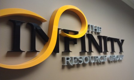
Lobby and reception signs welcome and direct your staff and visitors. Professional, sophisticated indoor signs help to promote the type of environment you want inside of your business.
 Brushed metal office reception sign mounted directly to the wall
Here are six points you may want to think about as you design your signs.
- Bright and light - Bright, light colors attract the eye. Depending upon the environment, a dull, grey sign with dark colors is not only going to be difficult to read, but is also less likely to attract attention. Many lobby sign materials are available in bright colors that provide contrast can really make a visual impact. Or, as shown in the Wildcat example above, a bright metal finish can contrast well against a light background.
- Simplicity works - Your lobby and reception signs need to be as simple and clear as possible while representing your unique company’s culture.

- Fast check - A fast visual check can be used to determine whether or not your signs are clear and easy to understand. Have someone look at your sign for one second and turn away. If they can't tell you what it says, your sign may need to be redesigned.
- Accurate - Details are what make up a big picture, and something as simple as a misspelled sign can leave a lasting negative impression with visiting clients.
- No clutter - Legibility is paramount. Your lobby and reception signs shouldn't be designed with clashing colors and busy backgrounds. Using design elements of with different colors and thicknesses can create visual "interest" and make the reception sign easier to read and identify.

- Top down priority - If you need signs that provide more than one piece of information, prioritize the list so the most important information is at the top.

Reception hallway logo signs using acrylic panels and architectural display hardware
Lobby and reception signs are part of the overall look and feel of your business. For professional help with your signage needs, contact the pros at 12-Point SignWorks, LLC. We're proud to serve businesses in and around the Franklin, Brentwood and Nashville areas. We can also help clients throughout the country.


Leave a Reply