Color is just too cool to not use! And as Paul Simon says, "everything looks worse in black and white."
When you attend a trade show, whatever industry you work in, you need every advantage you can get to bring the right buyers to your table. Imaginative, colorful trade show displays and signage are a big part of doing just that! A splashy design might not be enough, though, to reel clients and contacts in. Your color scheme needs to appeal directly to the audience you want to attract.
Attention-Grabbing Hues
The first job of your trade show displays and signage is to catch attention. At trade shows you're surrounded by people who are selling the same products or services that you are so you need to make sure that people are drawn to your displays, not your competitions'! Yellow, red and orange are your best bets for this. These are "hot" colors and arrest attention better than "cool" colors like blue, green, and purple. Yellow, whether a bright lemon or deep saffron, is the most visible color, so it works especially well at standing out from the crowd.
 A dynamic photo and use of architectural elements like this are great ways to introduce attention-grabbing color.
Red is considered the most aggressive color and can evoke some of our most primal feelings like courage, anger, romance, and...not to be left out...hunger. This can make it a great color for any company promoting an image of vigor and action or restaurants looking to stimulate the munchies. (Maybe that's why I feel the need to snack when I watch Netflix!)
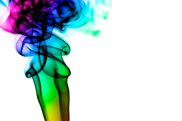
Neons like deep sky blue, electric violet and lime green are also striking because they are hot versions of cool colors. With high-resolution printing you shouldn't have trouble duplicating the particular shade you want. One caveat with these eye-catching shades: it's important to remember that a little goes a long way. An entire banner of bright yellow with red and orange print might be overwhelming or unpleasant to look at for an extended period of time. These should be your accent colors to grab attention to your most important information and services.
Meaningful Color Choices
While your trade show display colors should stand out, they still need to fit in with your company image. Bright shades will work well to convey a fun, playful image. Deep jewel tones, on the other hand, lend an air of sophistication. If you're going for a warm, inviting look, try golden yellows and oranges.
Blue is by far the favorite among most companies' signage. It seems to be universally loved (go ahead, ask everyone in your office what their favorite color is—most of them will likely say blue!) because it denotes serenity, intellect, and professionalism. Unlike yellow it's easy on the eyes, so your customers can spend a long time looking at your signage without getting overwhelmed.

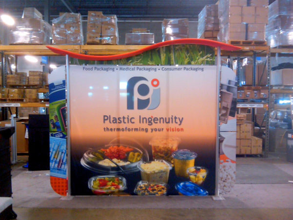
This company is using cool tech-looking blues that remind customers that they do IT and greens that play off of the maple leaf in its name
If your company is in anyway about being natural then the color green might be the best choice. Run a booth at a farmers market? Sell fair-trade clothing? Have the word "organic" anywhere in your company name? This is the color for you. Earth tones like browns and beiges work as well but they won't stand out or be as energizing as greens. Of course green doesn't have to be limited to the green market, but it does bring to mind nature—whether that be environmentalism or just being outdoors (think Dick's Sporting Goods or L.L. Bean).
In any case, color can go a long way in immediately letting your customers know what your company represents.
Your Color Scheme
How you combine your colors is just as important as the shades you choose. Bright colors are best used as accents, such as on portable banners. Too much is hard on the eyes, making would-be visitors look away instead of come over. Black and white accented with red, and blue and white accented with bright yellow have both proven to be good combinations.
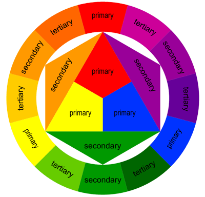
Image via: blog.asmartbear.com
To help you choose your combinations, it helps to look at a color wheel like the one above. Complementary colors are colors that point exactly across from each other on the wheel like orange and blue, red and green, and purple and yellow. That means that these colors generally play nicely with each other—that's why you'll see so many sports teams use these combinations in their jerseys. Colors that are very close to each other on the wheel—various shades of green compared to each other, for example—are called analogous colors. This means that they'll look fine together but nothing will really stand out. Ironically, having colors too close together on the wheel can mean that colors are standing out too much! For instance, look at the primary red and the tertiary purple next to it. It's really bright and clashing isn't it? Still, if it works for your company to break the rules go for it! Having that bright red and purple combination might work, for instance, if you are selling makeup because they remind your customers of lipstick shades. Have fun with it and experiment with color combinations before making a decision. A professional sign designer can help you choose a mix of colors that both grab attention and fit your brand.
If you need trade show displays and signage that speak to your target customers, get in touch with the designers at 12-Point SignWorks.


Leave a Reply