Buying business signage is a big investment! Of course, it's an investment that's proven time and time again to guarantee a great return on investment (ROI). But that great ROI is only guaranteed if you follow certain guidelines when it comes to your signage. Here are few tips on how to get the most out of your company's signage:
- Visibility: You're not going to get any traction with your signs if no one can see them! This seems like a rule that's so obvious you're tempted to smack your forehead and say "Duh!" like a snarky teenager, right? But you'd be surprised how often we see this basic guideline violated. Go big or go home, that's what we say! Make that puppy as big as your local sign ordinances allow. Light it up, make the letters large and sans serif, and for goodness’ sake throw some color in there! Be as visibly loud as the laws of taste (and the laws of the land) allow. A case study about Frenchy’s Bistro proved that going from nearly invisible signage to purchasing just one prominent sign allowed the restaurant to expand and increase its revenue by 322% in just four years.
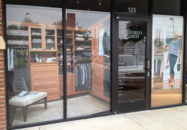
 Using store windows is a great way to make your signage visible! People can't help but see the large images splashed across your storefront.
- Maintenance: From the dawn of time, people have judged things based on appearance, and if you have a gross-looking sign, people will think your business doesn’t care about its practices. Most types of signs can be cleaned with a solution of mild detergent diluted in water. Anything from dish soap to vinegar will do the trick. Take care to especially clean around the edges of any vinyl decals you may have because it’s easy for dirt and debris to collect along the edges and creep behind the vinyl. This will cause your decals to lift and peel much faster than they would if they were regularly cleaned!
 Grab that spray bottle and a rag! You should keep your signs clean just the way you keep your store or office clean.
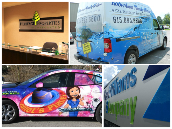
- Design: Many people need a designer for the same reason they may need a doctor, mechanic, or lawyer: because they aren’t trained to be one. Homespun logos and graphics made from using free vectors and clip art online may get the job done, but they won’t look nearly as professional as ones designed by, well, a professional. This isn’t to say that a professional designer is the end-all and be-all of having a great logo . . . but it’s definitely nice to have someone with lots of training and experience creating the images people will associate with your company. Professional designers also have access to a lot more resources than the average bear when it comes to images, design software, and fonts.
 Trust the design of your signage to people who have been doing it for years.
- Materials: It's important to order the right kind of materials for your signage needs. For example, if you would like a wall mural in a hot yoga studio, it would be a good idea to use micro-vented vinyl to keep mildew and bacteria from getting trapped under the wall covering in such a humid environment. Or, it might be even better to get the image and graphics you want cut out of acrylic because in a place that humid it will be hard to get vinyl to stick at all. 12-Point SignWorks is always happy to make suggestions and answer questions about the different materials you may want to use for your signage.
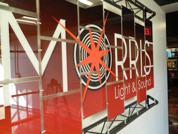
 For companies that like to frequently change the art and graphics they display in their lobbies, it's a good idea to get architectural display panels and cables because it allows users to easily change out designs.
So, how well is your business following these guidelines? Call us or click the button below to get a free consulation on your signage today!


Leave a Reply