Okay, okay that title was kind of sneaky. 99.99% of the time you really do want your storefront sign to stand out like a peacock in a chicken coop. But, believe it or not, there is such a thing as standing out too much.
-resized-600.png) Make your sign stand out because they're so great! Not stick out because they're out of place.
Make your sign stand out because they're so great! Not stick out because they're out of place.
In a historically sanctioned part of town, for example, it would probably negatively impact the image of your store to have giant LED channel letters when all the neighboring shops have carved wood signs or metal lettering. People frequent historic neighborhoods for the quaintness and the nostalgia, so having LED signs will probably look too modern (and perhaps even a little tacky) compared to to more handcrafted signs of your neighbors and competitors. Where channel letters would be great in a suburban shopping center or in most busy metropolitan areas, they just don't work in a situation like this.
This creates the challenge of learning to stand out without sticking out like a sore thumb. Consider your district or neighborhood as a brand. What do most people around you do? What's the general "feel" of the place? See what materials and styles people are using and then make yours better! To help you out, here's a list of common sign materials and suggestions on where they work best:
Bronze: Bronze signs are straight up classy. Because this dark, solid, and heavy material, was extremely common for signs made before the twentieth century, bronze signs give off the feeling of history and permanence. This makes bronze a great material for plaques, letters, and wayfinding signs for government buildings, banks, school campuses, museums, law offices, or any other serious or established entities.
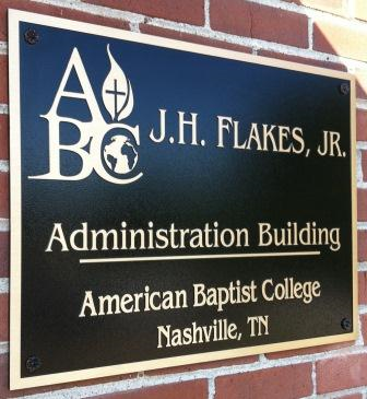 A college administration building is a great place for a bronze sign!
Brushed Metal or Metal Composites: Much like bronze, brushed metal letters or signs suggest professionalism and class. The difference is that where bronze gives a feeling of history, silver brushed metals suggest modernity. Brushed metal—particularly the much less expensive and lighter composite brushed metal sheets—is a great material for making sign lettering or to use as a backer for raised acrylic or metal letters and graphics. This makes the material great for banks, upscale retail stores, restaurants, hotels, and anywhere bronze signs would work.
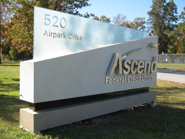 This may look like a stone monument sign, but it's actually made out of painted aluminum! The acrylic panel coming out of the top and the body of the sign both have metallic lettering as well.
Wood: Using wood for signage has become much less popular over time because it is often more expensive and less easy to manipulate and maintain than other materials—but that doesn't mean it's obsolete! Wood can be a great material for any historical, quaint, or "outdoorsy" organization. Signs for parks, bed and breakfasts, sporting goods stores, camp grounds, restaurants, and resorts all look great with wood signage. If business owners like the look of wood signs but not the price, there are many foamboard materials that can be made to look like wood at the fraction of the cost and weight.
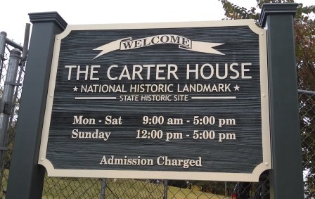 Imagine if the state of Tennessee had chosen to get a large neon sign marking this historic plantation instead of this post sign. It definitely would have stood out more, but it would have looked very out of place and would probably confuse visitors.
Lit Electric Signage: This is a great option for any business that sells goods or services directly to consumers. Which, as you know, includes quite a lot of businesses! Look for it the next time you're driving around after dark. Virtually every grocery store, bank, boutique, fast food chain, department store, and gas station will have lighted channel letters or cabinet signs outside their storefront. These signs are great at attracting customers off of any main roads or within cities with lots of traffic.
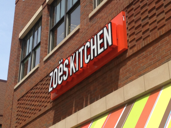 The light from electrical signage can be very effective at making your signs stand out in a good way!
Vinyl Window Graphics: These work well for any place that allows people other than employees to enter the building and that has regular hours, so window graphics are pretty universally a good option for signage. This is a great material for putting information like store hours on the glass doors leading into your building. You've seen those everywhere from pharmacies, to the mall, to banks, to the DMV—everyone uses them! The nice thing about vinyl is that it's very easy to digital print graphics on it, and vinyl comes in a variety of textures and styles (including frosted glass, chalkboard, and dry erase!). This makes it a great material for almost any company signage because it can be as wild or as understated as you would like or need it to be.
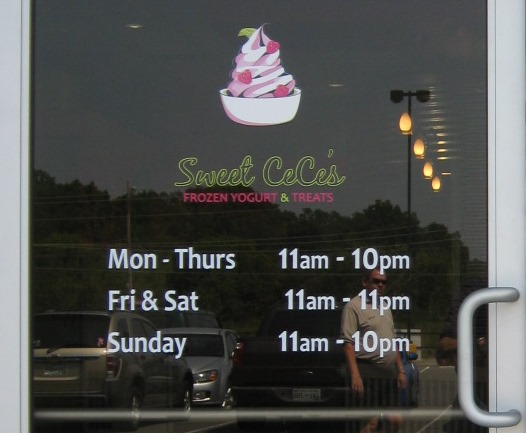 This is very simple—just a logo and white store hours—but having them makes a big difference to your customers.
Of course, where these styles and materials should go isn't set in stone. Do what you want to do! If everyone around you has channel letters but you really think your sign would look great with metal lettering, go for it! Just pay attention to whether or not you are standing out, which is great, or sticking out, which is not so great. :)
Need help deciding what kind of signage your business needs? Contact us today to speak to a signage expert and get a free quote on your project!


Leave a Reply