The 86th Annual Academy Awards Ceremony is this Sunday and all the stars in Tinsel Town are going to be duding up and strutting their stuff on the red carpet. Because that's what people actually care about when it comes to awards shows...the red carpet outfits! Sure, it's nice to know that your favorite movie won an award for "Best Original Score," but what you actually care about is what people are wearing. The snarky articles in gossip magazines aren't about who won what, but "who wore it best." As you get together with friends this weekend to eat snacks and comment on the private lives of celebrities, pay attention to what the stars stand in front of as they float down the red carpet.
As with most awards ceremonies, stars stop and pose in front of step and repeat banner backdrops made by using large format printing on fabric or foam boards. Step and repeat means that a logo or graphic is diagonally repeated on a wallcovering or banner. This lets the name of the event or the sponsors supporting it be seen in every picture taken for fashion and lifestyle magazines that will be circled around the Internet for weeks to come. Not a bad way to get some publicity!
I personally think the gilded triangular logo used for this year's Academy Awards looks spot on, but what do you think? Let's play which 2014 awards ceremony wore the best step and repeat pattern!
1. Academy Awards Nominees Luncheon
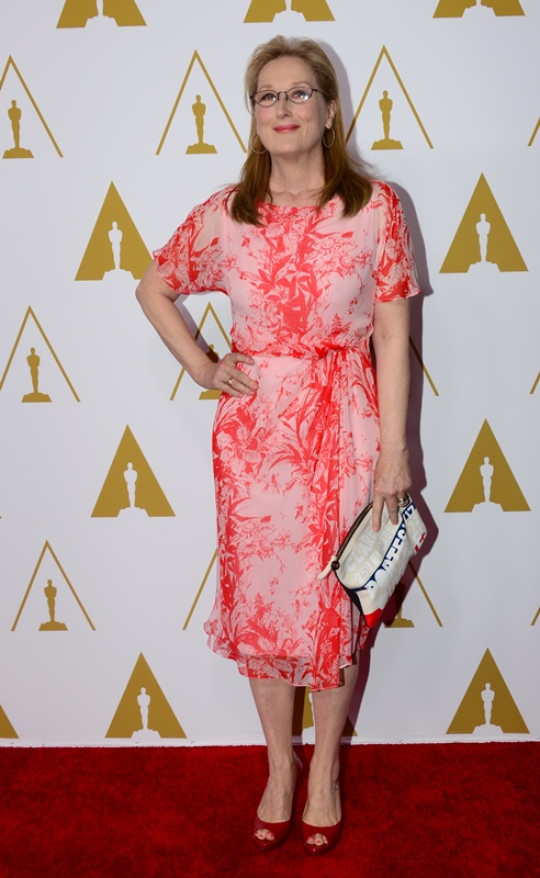
Which is more fabulous, that step and repeat pattern or Meryl? It's hard to say! Can anything really beat Meryl? The logo, which is inverted on every other step, is simple yet elegantly effective because the image is instantly recognizable. This one gets the 12-Point seal of approval!
2. The Grammy Awards
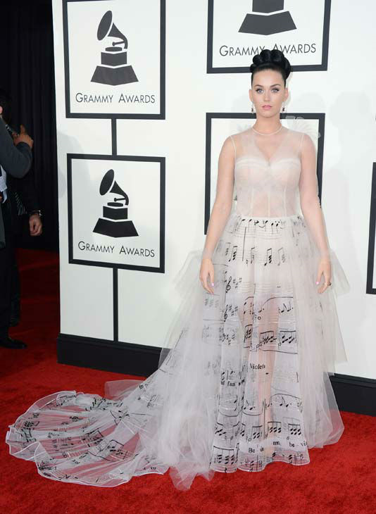
The Grammy Awards really stepped it up this year by utilizing the subtle flat design (that is so in right now) of a gramophone they've been using for years. This award season, however, the design is in a chic contrasting black and white pattern that even rivals the music notes on Katy Perry's dress.
3. The Critic's Choice Awards
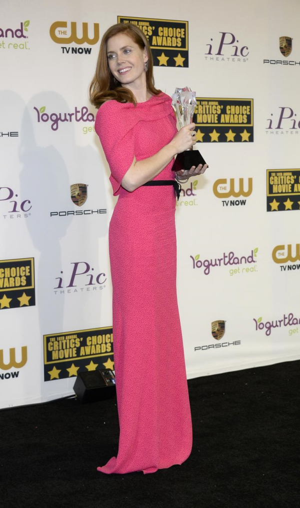
Amy Adams may look darling, but this step and repeat behind her does not. Not loving the logo for the Critic's Choice Awards this season, or the way the different sponsor logos look together. Yogurtland and Porsche seem a bit like apples and oranges, don't they? But, we understand that sometimes function overrules form and ya gotta do what ya gotta do. It is effective, anyway. I totally want fro-yo now!
4. The Screen Actor's Guild Awards
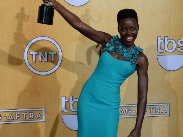
I was also a little underwhelmed by this step and repeat backdrop for the SAG Awards. Not even the gorgeous Lupita Nyong'o can make that murky yellow look good (although it does contrast well with her amazing dress). Also, what is up with the outlined logos. That is so mid-century, and not in the classy way.
5. The British Film and Television Awards (BAFTA)
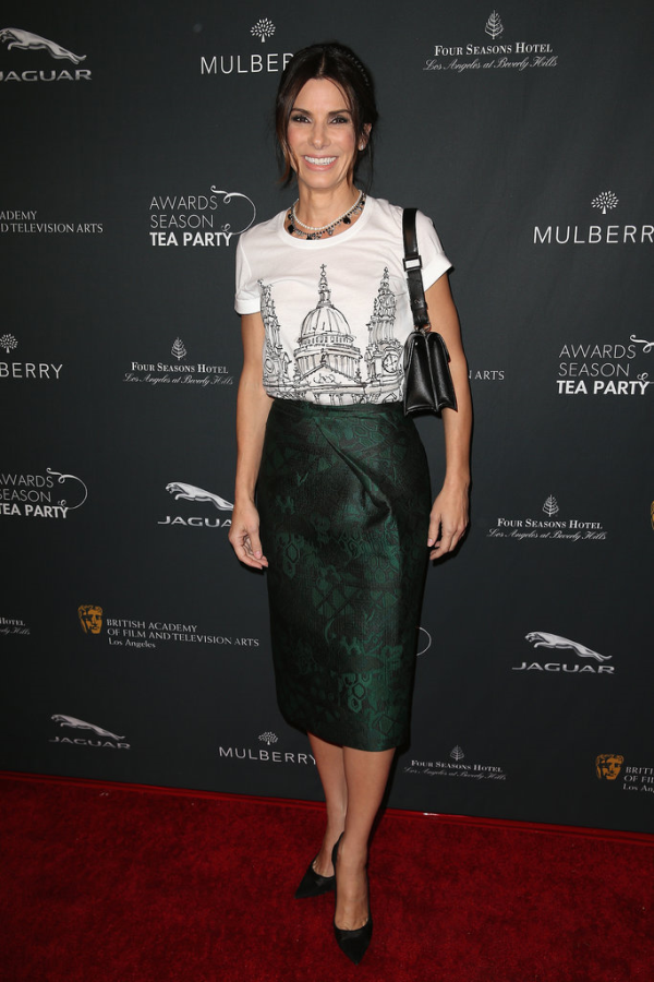 Aces! Smashing! This deep charcoal step and repeat backdrop at the BAFTA red carpet seems to exude sophistication and elegance. The relative uniformity of size and color of the logos keep it from looking too busy so as to not distract from the main event—stars like Sandra Bullock here modeling for us. Also, can we talk about the fact that they have an award season tea party? I don't think it gets more British than that!
6. The Golden Globe Awards
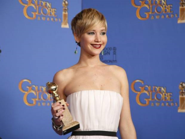
Wave hello to Jennifer Lawrence: America's Sweetheart! The logo design for the Golden Globe Awards looks a tad dated, but overall this step and repeat pattern isn't all bad. The periwinkle blue is a nice soothing color to have chosen for something that will covers so much surface area. Final verdict? Not bad, but ultimately forgettable design.
Bonus Round: A step and repeat red carpet gown
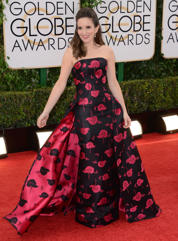 Thank you to Tina Fey for going the extra mile and getting a dress with a step and repeat pattern to match this blog post.
So, who do you think really stepped up their step and repeat backdrop game this awards season? Tell us below in the comments!


Leave a Reply