Have you ever had a Chupa Chups lollipop before? These Spanish lollipops have been a favorite of children all over the world for over 50 years! Part of what has made them so successful (other than the fact that they are delicious, of course) is their unique and instantly recognizable logo.
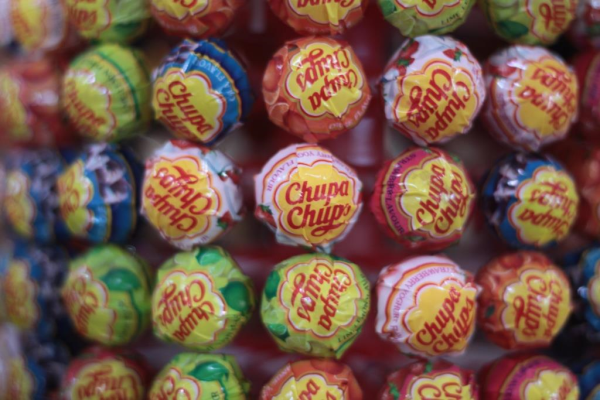 Photo via ricardo/zone41.org on Flickr
What you may not have known about Spain's most famous candy is that the logo was designed by one of its most famous artists. This guy right here:
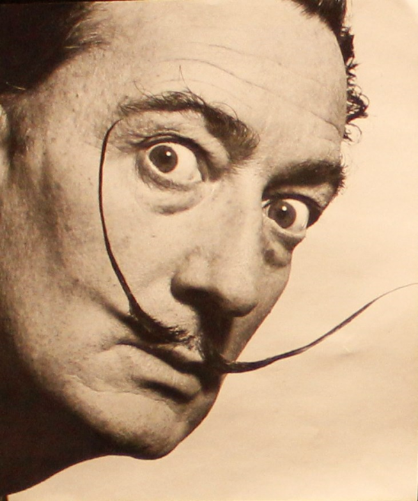
"Hey man, I heard you needed a logo."
Spanish candyman Enric Bernat is the person you can thank for thinking to put candy on a stick. He saw that regular sweets didn't meet the needs of children—his primary consumers—because they would make the children's hands sticky and get them in trouble with their mothers. So, he put the candy on a stick (It's "like eating a sweet with a fork!") and the lollipop was born! He first called his company "GOL" because he wanted to capitalize on the popularity of football to promote the ball-shaped candy. The sucker was the soccer ball and the child's mouth was the net. But, the campaign missed the mark and didn't bring Bernat much success. In 1958 he hired an ad agency and they changed the name to "Chups" and then "Chupa Chups" after the success of a catchy jingle they made. The name derives from the Spanish word "Chupar," meaning "to suck." There was still trouble with branding however, what logo design should he go with to market his newly named confection?
Bernat was complaining about his dilemma over coffee one day in 1969 with none other than his artist friend, Salvador Dali. Yes, that Salvador Dali. The one with the bizarre mustache and melting clocks. Over the next hour or so Dali doodled on newspapers until he worked the company name inside of a golden daisy.
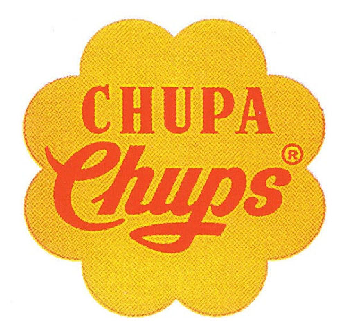
Original Chupa Chups logo designed by Dali in 1969
The logo may seem very simple but it just goes to show Dali's genius as a salesman as well as an artist. The bright primary colors used for both the flower and the font are sure to stand out to children at candy stores. Dali also thought to put the daisy on the very top of the lollipop wrapper so the logo never gets crinkled or obscured. He wasn't just thinking like an artist, but like a man who knew how to sell things using art (aka a graphic designer).
If you are wondering why such a famous modern artist would trouble himself with something as commercial as a logo design, it was because the man rarely turned down a paying gig. Fun fact: Dali's fellow surrealist buddy André Breton called Salvador Dali "Avida Dollars," which is an anagram of Dali's name that roughly translates to "eager for cash." Maybe not so artistically idealistic, but that doesn't diminish from the results of his work! The Chupa Chups daisy is one of the most enduring pieces of branding of all time and, other than a slight update in 1988, the design has barely changed from Dali's original sketch.
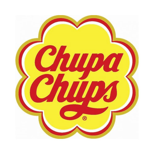
Logo update in 1988. This design is still used by the company today.
Over 4,000,000,000 in sales later, the Chupa Chups logo can still be found on the tops of their lollipops. They didn't stop at the candy wrappers to brand, though. Chupa Chups delivered the candy to sweet shops in company fleet vehicles with their branding on the side (because vehicle wrap advertising totally works) and set up the lollipops in P.O.P displays that they had designed.
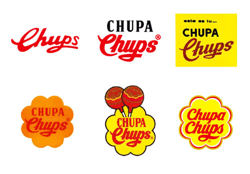
The evolution of the Chupa Chups logo via chupachups.com
Today, the brand itself has become so popular that the confectioners were able to create a "lifestyle" market in addition to selling their candy. Chupa Chups partners with manufacturers to put the Chupa Chups brand style on all sorts of products. The logo is put on everything from brightly colored nail polish to t-shirts to video game accessories urging people to live a life "less serious."
It just goes to show that something as seemingly simple as a logo design can take a company a long way!
Looking for your own company logo design? Contact us today to talk to one of brand experts and graphic designers!


Leave a Reply