Environmental graphics don't have anything to do with being green! They're the type of graphics that are springing up in the trendiest and coolest up and coming companies that blur the lines between utility and art. They're called "environmental" graphics because they are a part of the environment of your office space. Honestly any kind of business signage can be considered a type of environmental graphics because signage shapes the design and branding of your building.
But how do you incorporate eye-catching artistic elements into your office space without detracting from their utility? Check out these examples of people who are doing environmental graphics the right way!
Wall Murals
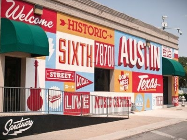
The front of The Sanctuary Print Shop in Austin, TX is well beloved by locals and tourists alike. The fun typography and colors used are distinctly depictive of the youthful scene of Austin, turning the print shop into more than just a print shop. It's a destination and venue for events as well!
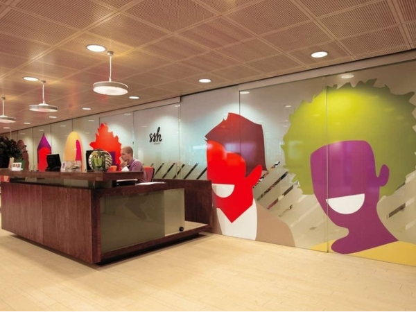
The SSH Student Housing company in Amsterdam has been around since 1956, providing students with a place to live, eat, and study. But just because they've been around for decades doesn't mean that they can't have a fresh style! They hired Studio Dunbar to freshen up their identity, which included this extremely fun wall mural.
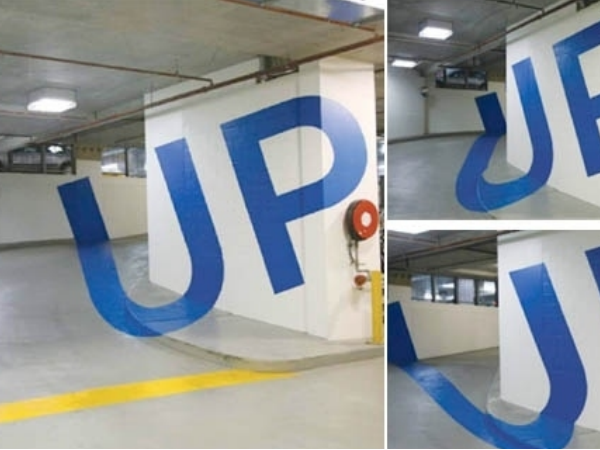 Eureka Tower Parking Garage in Melbourne, Australia has cheeky murals as their directional signage. When looked on from the correct angle, the words "up," "down," and the numbers for the particular floor appear out of the seemingly abstract lines painted on the floors and walls.
Wayfinding Signage
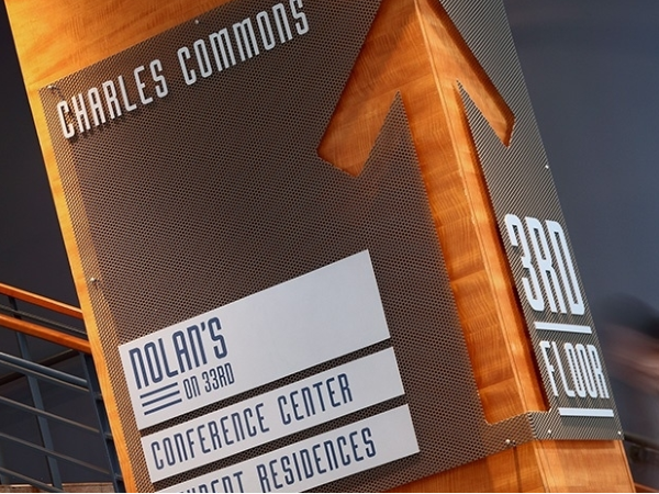
Wayfinding signage for John Hopkins University Charles Commons utilizes the architecture of the building and inexpensive metals to create a very unique, useful, and beautiful directory. It's pretty amazing how something so small can make a huge difference in a space.
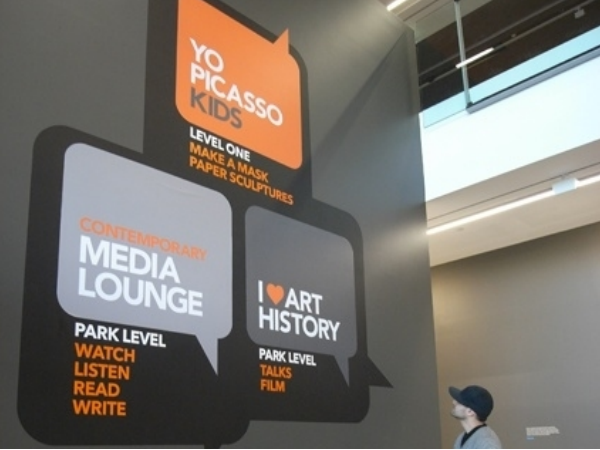 This wayfinding mural was designed by students specially for the Picasso exhibit at the Gallery of Modern Art (GoMA) in South Brisbane, Australia. The great thing about wall graphics is that they are removable and relatively inexpensive so they work really well for temporary things like this.
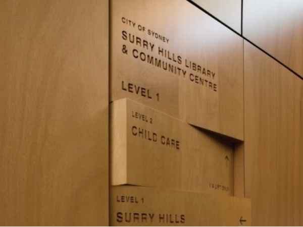
The directory signage for the City of Sydney Surry Hills Library is literally part of the buildings environment! Each letter was engraved 5mm deep and left unpainted or finished to show the raw material inside the letter. This particular wayfinding signage has won several awards and has been featured in architecture and signage trade publications for it beautiful simplicity.
Sign Letters
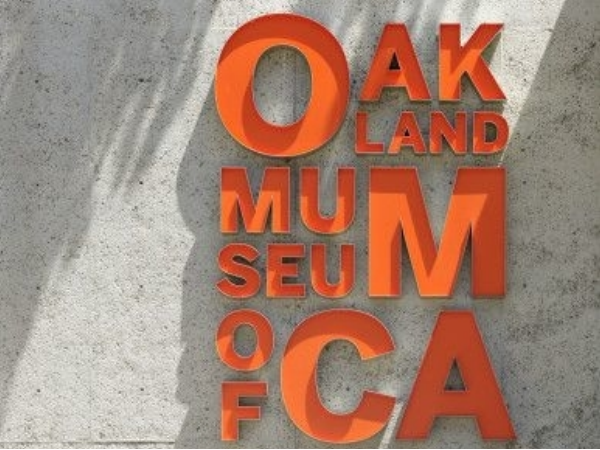
The Oakland Museum of California exhibits all things Californian from natural history to art to culture. The environmental graphics were added in a large redesign that went on between 2009 and 2013, designed by Skidmore, Owings & Merrill. In a building that's already known for it's beautiful interior and gorgeously landscaped exterior, it was important that the designers created signage as well-designed as the rest of the surrounding environment.
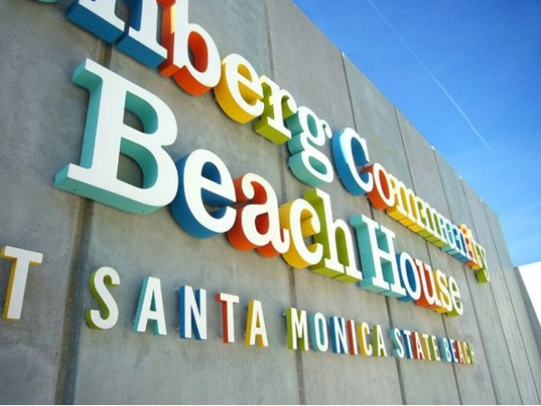
The Annenberg Community Beach House At Santa Monica State Beach began in the 1920s as a privately owned residence commissioned by newspaper magnate for actress Marion Davies. During the golden age of hollywood, the beach house hosted many of Marion's famous friends like Samuel Goldwyn and Clark Gable. In the 1940s it was bought and converted into "Oceanhouse," a fabulous hotel, along with a "Sand & Sea Club." The property was eventually given to the state of California in 1959, and in 1998 Wallis Annenberg donated $27.5 million to help turn the site into a year-round public beach facility and community center. In 2009, it opened to the public. These colorful and classic sign letters embody both the fun, beachy feel of the community center and the simple glamour of its past.
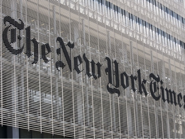
These sign letters designed for the exterior of the New York Times' building were designed by Pentagram design group in New York City. Not only do these environmental letters catch attention, but they stay completely on brand with the newspaper. The shape of the giant letters exactly mimics the same typeface used for the world-famous newspaper's front page.
Window Graphics
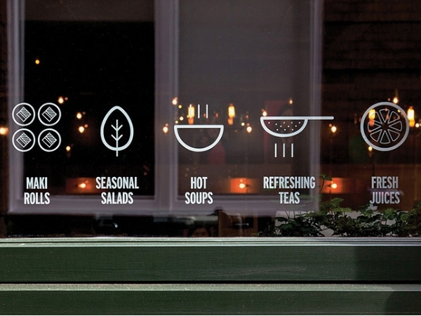 Yoobi Hands on Sushi in Soho, London uses window graphics as the cherry on top of an already great branding identity. Located in the heart of London's Chinatown, Yoobi incorporates Asian aesthetics with a clean and modern twist that makes them stand out from their competitors to people passing by. Another great thing about these window graphics? It lets potential diners know exactly what sort of food they can expect if they come in.
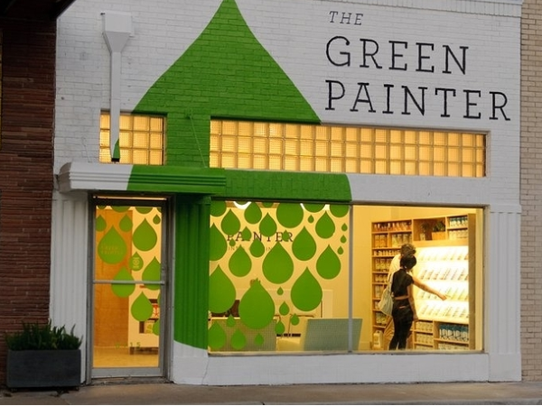
The Green Painter in Houston, Texas is a home store that sells "healthy and green" alternatives to stains, paints, and other DIY project materials. Utilizing the front windows of their store to continue their large logo of a green drop from the painted brick not only is a great way to catch the attention of people passing by, but (we assume) to show of the ability of their own products on brick and glass.
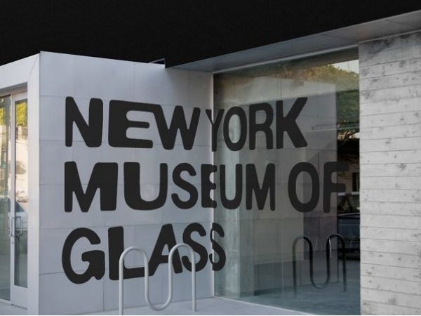 Unfortunately, this New York Museum of Glass does not actually exist! It was a concept designed and created by Leo Porto. But we thought we'd throw it in here anyway! If such a museum did exist, this would be an extremely clever way to use the building's existing glass in a way that was more playful than literal.
So, what do you think? Are you inspired to get your own game-changing environmental graphics?


Leave a Reply