Sometimes a great window display is all it takes to turn "window shoppers" into actual customers. Have you ever entered a store simply because your curiosity was incited by something shiny in the window? I know I have. I'm like a magpie; if something is covered in glitter, I immediately want to collect it. As online shopping because more and more popular, it's more important than ever that brick and mortar stores create window displays that draw customers into their doors. But never fear, you don't have to (and probably shouldn't) break the bank to have a great window display. Here are a few tips to make your window displays turn into a conversation piece without costing you an arm and a leg!
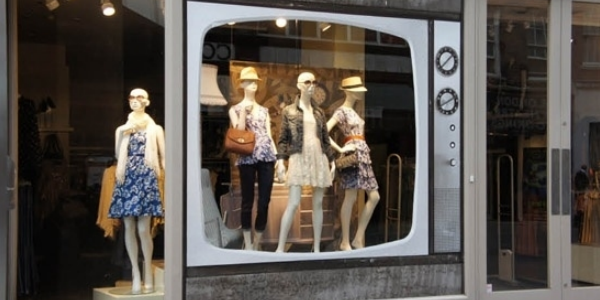 The key to having great displays without paying a ton? Creativity.
1. Brainstorm and list
Start with your theme, of course! Try to think outside of the box. Easier said than done, I know, but listing out a bunch of ideas will help you weed out what will be too complicated or what just won't work well for your store. Talk to your employees and have them pitch ideas, or take to online idea sources like Pinterest or the Retail Design Blog. Having a solid idea of what you're looking for will help your overall design and will help you stay on budget as you buy supplies based on exactly what you have planned out.
2. Make a Budget and Materials List
No matter what project you're taking on, it's probably good advice to start with a budget. Limiting your budget will actually help you be more creative and think outside of the box because your resources will be slightly more limited. As you start to list the materials you need to accomplish your design, you'll see how quickly the cost of arts and crafts equipment can add up! Try to shop for materials seasonally—for instance, if you know that one of your vendors has a great sale on paint in the spring, that would be a great time to buy some in bulk that you can use throughout the rest of the year. Also, take into account what you may already have lying around in your supply closet like tape, glue guns, paper, and carboard. Everything can be turned into a work of art with the right direction!
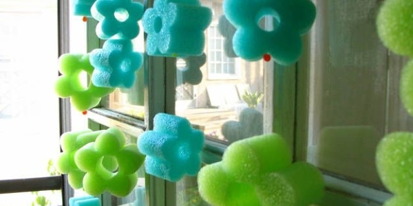
This shop owner sliced up a cheap pool noodle and then strung the pieces into a garland for a summer-themed window display. The whole thing couldn't have cost them more than ten dollars but it's fun, colorful, and eye-catching.
3. Sketch it out
Create a rough sketch of what you want your display to look like before you start creating it. This way, you have something to reference if you have multiple people working on the display. It's also useful to remind you exactly where things ought to be placed. One design blog suggested taking a picture of your window from the outside and then laminating the print of your photo so you can use washable markers to sketch your designs directly on your window space again and again.
4. Take the elements into account
Is there a part of your window that will get a lot of glare from the sun during the day? Keep your products or brightly colored elements of your display out of those sections to prevent fading. Do you have plants growing outside your storefront? Try and incorporate them into your design. Be aware of the outside elements that will affect your display and plan accordingly.
5. Tell a Story
Think of your window display as a vignette or diorama. You are showing, not telling a story. It doesn't have to be literal—"we sell good shoes" or "you can buy hats here"—either. stacks of your product with prices next to them can get the job done, but it won't delight your customers the way adding a bit of whimsy will. The clothing store Anthropologie is particularly good at this and will often carry the "theme" of their window display into the store. I've seen them do everything from covering the outside of the storefront with swirls of paper butterflies and putting fluffy blue-green jelly fish made out of tissue paper in their windows for Earth Day, to making an antique-style couch appear to be floating on clouds by anchoring the couch to a back wall and putting white balloons underneath and out of the sides of the couch. Get creative and catch people's attention!
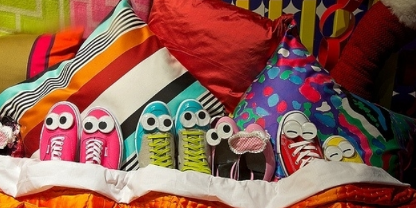
How fun is this?! Although it is a little busy, putting googly eyes on the shoes is a fun way to display their product that people will remember and talk about.
6. Outsource if you need to
If you don't think of yourself as particularly creative, it might be a good idea to hire a designer or even a fine artist to design your displays. If you don't want to pay full price for a professional window dresser, look to local colleges for design students. Although you should still pay for supplies and a fair day's wage (they eat enough ramen as it is without taking time to work as unpaid labor for you!), students will often come up with great, fresh ideas for your windows for less because they are eager to pad their portfolios and gain professional experience. Employees are also a great resource for creativity, and you're already paying them anyway! You just might be surprised by what your staff comes up with in a brainstorming session.
7. Think from your viewer's perspective
Because your store's window front may be raised, what you think is at the eye-line of people walking by might be different than where the eye-line actually is. Look at your window from the outside and mark with dry erase markers or tape where you want people's eyes to be drawn. This will help you as you as you set up the elements inside the display to mark where things need to go. Also take into account how people will be passing your store. If you are located on busy street where there are few pedestrians and a lot of cars, you'll want your display to be punchy and simple because no one will be able to see extremely detailed or small elements. On the other hand, if you run a boutique in an area where you'll get more foot traffic, delight your customers with a detailed and fun display that they'll see up close. If you'll get a mix of the two types of traffic, mix detailed and large elements in your display.
8. Use color
People notice bright colors before they notice drab ones! Everybody knows that colorful things are stimulating and have the ability to elicit emotions or thoughts. Why do you think so many things targeted toward children are so colorful? Because it encourages them to engage with the product! Using pops of bright color in elements where you want to draw the most attention in your display contrasted on a neutral background can be really effective. Using one bright or rich color can also be really visually appealing.
9. Light it up
Lighting is extremely important. The human eye will naturally draw to light, motion, and color before anything else. Even if it's just a string of Christmas lights, it's better to have something twinkling in your window than nothing at all! Lighting is like a spotlight constantly shining right on your products and turning them into the stars of the show. Lighting is also a great thing to have if your store is open in the evenings, showing people your storefront even after the sun goes down.
 Spotlights let passersby admire this creative display even after it gets dark.
10. Isolate the display from your store
Although many storefront windows are already built as a sort of boxed in space, many others have no back and will show the entire store behind it. It can really help your design if you put something up to block out the rest of your store and focus the attention on the display itself. You definitely don't have to spend a lot of dough to build out a wall, though! A large piece of fabric or foamboard hung a few feet behind your window can give you the blank canvas you need to create your design.
11. Surprise people
A jewelry store, for instance, can layer chunky necklaces and bracelets on cardboard cutouts of animals instead of on mannequins or small velvet jewelry displays. It would be weird, but in a fun and memorable way. It would definitely be different enough to make people take notice. There are approximately one zillion examples of people who have done a great job of this so I'll just advise you to type "retail window display" into a Pinterest or Google search if you really want to see some excellent examples.
12. Create depth and pay attention to composition
You'll usually only have spaces that are a few feet deep to work with, but you can still create a deep, layered look that can be more interesting. Use vinyl window graphics directly on the glass for a easily installed and removable way to create layers between the window and the elements stacked or hanging within the space. There are general design rules that all designers know that will create a more visually interesting composition. Place things off-center or create asymmetry (although strict symmetry can sometimes also be eye-catching), put things in odd-numbered groups, or create visual "lines" for the eye to follow (the biggest or brightest element to the next element to the next element, etc.)
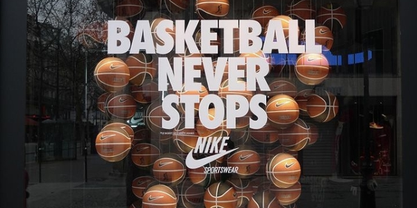
Using vinyl window graphics and hanging digitally printed basketballs creates depth and is visually interesting.
13. Sometimes less is more. But sometimes it's not.
Showcasing one item can sometimes be much more effective than cluttering your window with every product you sell. Use your lighting or the other elements of your design to draw peoples' eyes to the product you are promoting. However, sometimes having a window that's filled with items (as long as it's well composed) can be a big draw to your display. Use your judgment and stay true to your brand!
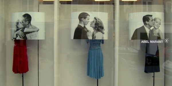 This is a great display! All this store owner probably had to purchase specially for the display were the prints of the famous on-screen couples. The simple composition and the contrast between the black and white photos with the colorful dresses brings the design to life.
14. Switch it up
Frequently change your display! It doesn't have to be every other week, but regularly updating your window display will keep it interesting to customers. You should at the very least change it seasonally or for major holidays like Christmas. If you are being creative and budget-conscious, then it shouldn't cost you very much to change your display throughout the year.
So, what do you think? Do you have the creative clout it takes to dress your own windows? What are some methods you've used before? Leave a comment below!


Leave a Reply