If you're not familiar with design, then putting together the text and images for your company's business signage or banners can be a little daunting! Thankfully, full-service sign companies should be able to help you pick elements and even design something completely new for you. But for all you DIY peeps out there, here's a quick and dirty tutorial on what you types of fonts you should be looking for.
Serif Fonts, Sans-Serif Fonts, and Slab-Serif Fonts: Learn the Lingo
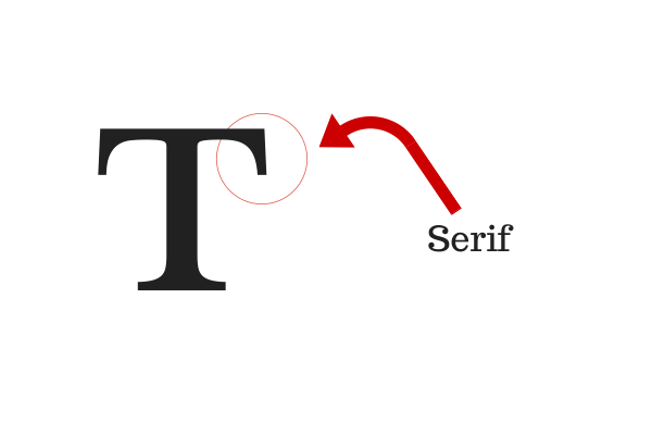
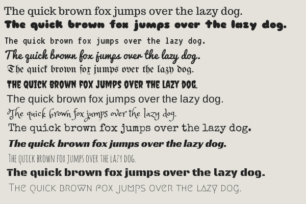
Serif fonts have strokes on the edges of their letters (except for "O"). The strokes themselves are called serifs, which is where the name for the font group came from. Serif fonts are generally believed to have originated from ancient Latin, based on the style of stone carvings of Roman antiquity. Serif fonts can be further categorized as old style, transitional, modern, and slab-serif depending on the thickness of the strokes and lines in the individual letters.
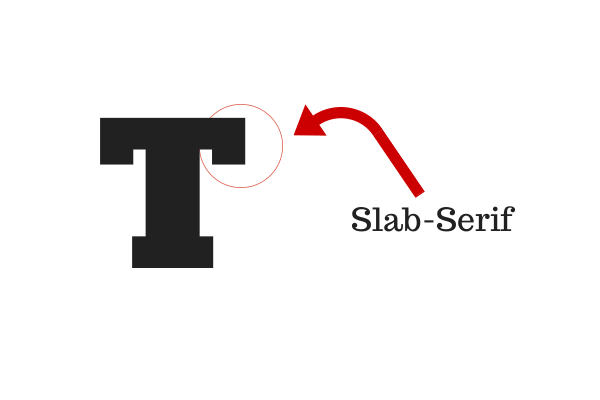
Slab-serif fonts are essentially serif fonts, but they are more geometric and less angular. There is very little distinction between thick and thin lines in slab-serif fonts. The first recorded uses of slab-serif fonts was in 1815 using the font "Antique" created by Vincent Figgins.
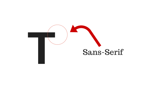
Sans-serif fonts are fonts without serifs. The French word, sans, means "without" so the term literally translates to "without serifs." Although there are some examples of Ancient Greek uses of sans-serif, this type of font didn't become commercially popular until the 1700s.
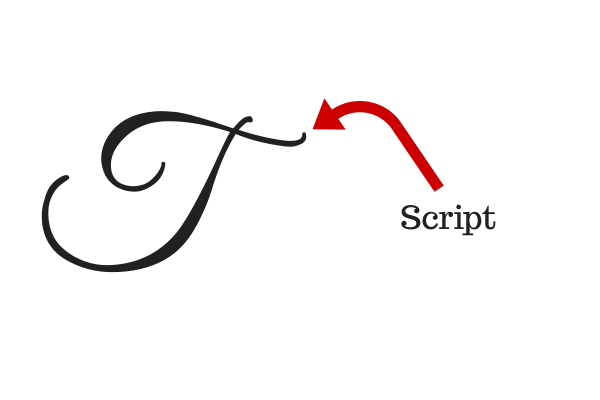
Script fonts are calligraphic fonts that look like they could have been hand-written. They basically look like the cursive handwriting of someone who has a really neat and consistent scrawl.
In addition to these four types of fonts, there are scads of highly decorative and unique fonts. You know what I'm talking about, right? For example, the Christmas ones where every letter looks like a candy cane. Or various wingdings—the village idiots of fonts. Although these may be fun for holiday newsletters or letters to your grandma, they should generally be avoided for business because they can easily look dated, hokey, or like clip art.
Readability vs. Legibility
Two things you need to consider when choosing fonts are readability and legibility. If something is legible, then it is easy to distinguish individual letters. If something is readable, then it's easy to read large portions of the text.
Fonts with serifs are more readable because our minds are trained to read body text based on the differences in letter heights and on serif position. Serif fonts usually have ascenders—lines that extend above the x-height—with letters like d, b, f, and h being taller, and descenders—lines that extend below the baseline—with letters like y, g, and p. This is like a visual map that is ingrained in our minds from the time we're first trained to scribble characters with #2 pencils on generously ruled paper.
Sans-serif fonts, on the other hand, are more legible from a distance. This is why most street signage uses sans-serif fonts: because there isn't a lot of body text to read through but it's very important that the information is visible to people driving by. Stop signs with their thick, white block letters are a perfect example of the legibility of sans-serif types.
Slab-serifs and script fonts aren't quite as readable or legible as the other two. Slab-serifs because there's less of a difference between the serifs and the rest of the character and script fonts because there's less weight and uniformity to the individual letters. But this doesn't necessarily mean that they don't have their place in signage!
What does this mean for signage?
It would be easy to say that all signage should use thick sans-serif fonts because they're the most legible from a distance, but sans-serifs aren't necessarily the best fit for all businesses. When looking at which font to choose, you need to be considering two things: your brand and visibility.
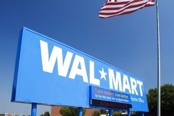
Many large retail chains and corporate chains choose to get sans-serif letters for their signs because they are easily visible from a distance. Starbucks, Wal-Mart, Target, Best Buy, and many others get their iconic sans-serif letters in either extremely tall or lighted (or sometimes both!) signs so that people who are looking for their products from busy roads, and even interstates, can find them quickly.
Sans-serif fonts are the most popular fonts for signage.
They can be extremely effective at advertising your business, but you may risk looking generic because sans-serif fonts are so popular and many of them are very similar. If your location means that customers are most likely going to be looking at your business from a road or other substantial distance, it is definitely recommended that you use either sans-serif fonts or very large slab-serif fonts or serif fonts to make your signs as legible as possible. Never choose script fonts for signs that need to be seen from far away.
You can always mix the types of fonts you're using as well. Putting the most prominent or important information in sans-serif while putting supplementary information in serif or slab-serif fonts. This is a popular option for banners that will have more text on it than a typical business sign will.
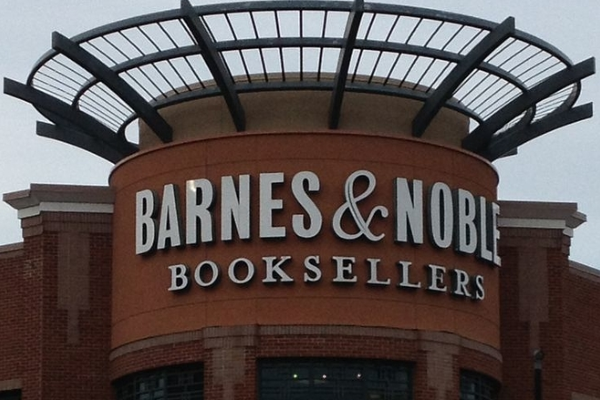 Barnes & Noble Booksellers mixes sans-serif and serif fonts for an instantly recognizable sign.
It's also perfectly okay to have a unique or atypical font for your signs, as long as it's legible and fits your brand. Businesses that revolve around children like daycares, toystores, or children's boutiques will often have cartoon-y and bright signage. This is great because it fits their brand and still is easy to read if they do it right. The clothing store H&M has a calligraphic font for their signs, but because it's thick and because there are so few characters on the sign (just "H&M") it works. Jeni's Splendid Ice Cream up in Nashville uses a script font that looks like it was handwritten. It works for the ice cream parlor, though, because their storefront is very close to the street and sidewalk so it's still very visible while also appearing casual and fun.
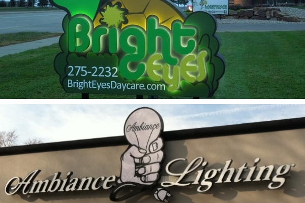
The signs in the pictures above are examples of exceptions to the general rules. The first one because, even though the daycare used sans-serif channel letters that are normally great for signage, they used green letters layered on a green background and a non-traditional font that isn't immediately recognizable. It all just sort of mushes together. And, even though the second sign is in a script font, it's large and clear enough for people passing by to immediately read it. Although they may initially miss the word "Ambiance" in the filament of the lightbulb, they'll at least be able to read the name of the store.
Hopefully that's helpful! If you have any more questions about signage, scroll through our blog or give us a call!

Leave a Reply