Sometimes the ins and outs of branding can be tricky. Probably because there aren't a lot of hard and fast rules! Although it's important to remain consistent in the materials your company produces to build your brand, it may also be necessary to refresh the image over time or adjust the look of something due to demographic differences.
To illustrate the points about branding, let's look at a company that does it really well: McDonald's. Think what you will about the fast food franchise, but they have done an excellent job of creating a brand that is recognizable even when it hasn't been exactly the same throughout the years or locations. Look at the pictures below. The three McDonald's restaurants in the pictures have a pretty different design, but anybody can see that they are all related.
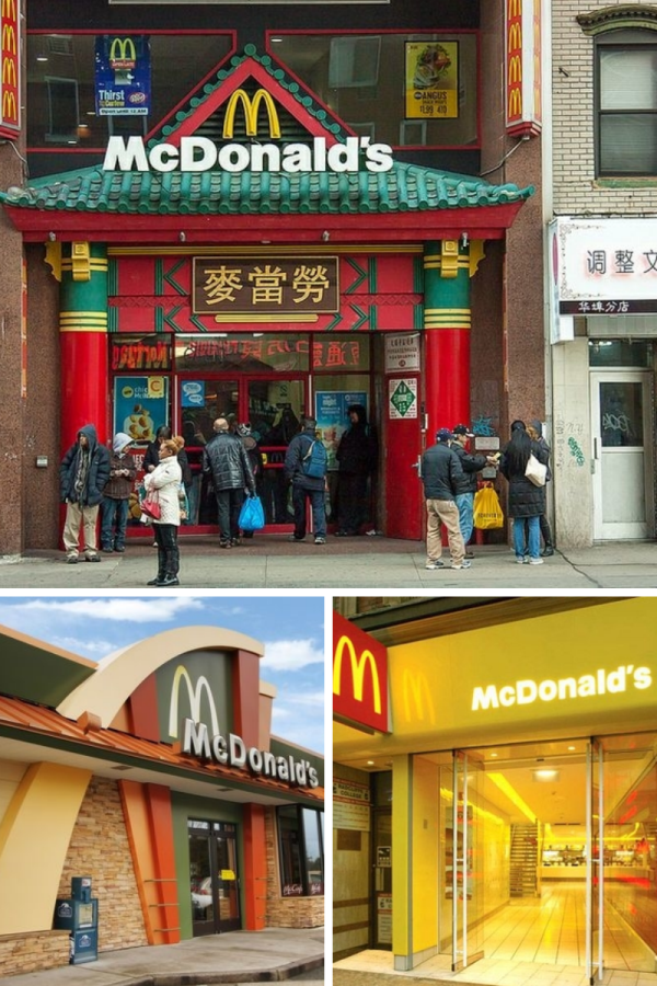
This is a great example of how strong branding techniques mean that new or regional productions don't have to be exactly the same.
Even though all the McDonald's restaurants have a very different design, there are a few things that stay the same throughout that help people immediately recognize the fast food restaurant. You'll notice that logo, color, and typography remain the same throughout.
Logo: McDonald's has done a great job through the years of turning their logo into something iconic by using it frequently and rarely varying from it. The "golden arches" are an immediate indicator of the brand. It's helpful for companies to have some sort of icon (like a yellow "m") that their customers will recognize no matter what it's put on.
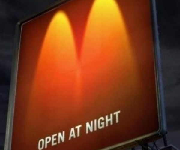 This billboard uses two "golden arches" of light on a red background to cleverly advertise that McDonald's is open at night. It's not even a full print of their logo, but the mere suggestion of color and shape is enough to let people recognize that this advertisement is for McDonald's.
Color: Although a surprisingly large amount of people surveyed said that orange was one of the brand colors for McDonald's (they mentally melded the yellow and red brand logos), the red and yellow colors are part of what makes McDonald's' brand recognizable. All the restaurants in the pictures above have both red and yellow incorporated in their design, even if there are also other colors used. This is one of the critical tests of an iconic brand design. For example, white script font on a red background would probably still remind you of Coca-Cola, even if a different company's name was used. People would probably assume that an orange work bucket was purchased at Home Depot instead of Lowe's. Color makes more of an impact than we may initially realize, so be sure be consistent in your palette no matter what else changes.
Typography: Although the font used for different advertising campaigns may vary over time, the type used for the "McDonald's" signs remains the same at all restaurants in all countries. Sure, some are lighted, some are beveled, some are plastic and some are metal, but they are all the same exact shape and style. Keeping this small element consistent allows the company to change the architectural look of their restaurants without muddying up their identity. This is also helpful when, as the style of the buildings and interior decor inevitably gets updated over time, the identifying sign remains the same throughout the years.
That's just one example of a company that does a good job having a versatile but consistent brand. Which companies do you think do a good job of this? Leave a comment below!


Leave a Reply