Logos are the visual identity of a brand or company. You've heard of first impressions, and a logo is often times just that. Because of this, logo development can be a bit intimidating. How can you guarantee the success of your logo design? Will your logo be memorable? Will it reach your target audience? Will it help your brand succeed? No pressure...right!?
A logo is displayed in many different formats: product packaging, marketing materials, uniforms, advertising and more. All of these areas need to be considered when designing a logo. If you are starting the process of logo development, or maybe even considering redesigning your current logo, here are five basic logo design styles to consider.
Brandmark (Symbol or Icon)
The brandmark logo design consists of only a symbol or an icon. These logos offer a simple representation of a brand or company without using words or letters. Brandmark logos should have a bold, abstract design. They should not include lots of colors or fine lines.
Brandmark logos are often used for:
- International companies (where language barriers can exist)
- Large companies with an iconic image (i.e. Apple, Nike, Target)
- Companies with long names
There are risks when using brandmark logos. Since the logo design does not include the company name, this may not be a good choice for a business just starting up or companies with a small geographical range.
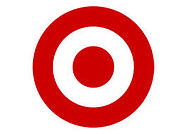 It makes sense that the brandmark logo for Target would be...a target.
Wordmark (Text Only)
Wordmark logos contain one or more words. In a study done earlier this year, looking at the logo design styles of the world's top 100 brands, 37% of the logos were made up of text only. Usually this logo design uses a unique font that exemplifies the individual brand's image.
We often see wordmark logos for:
- Small companies just starting out
- Companies with catchy, short and/or memorable names (i.e. Disney, Coca-Cola, FedEx)
Font and color are significant components of a wordmark logo. Be sure to choose a font that is reader-friendly and communicates your brand's identity. Likewise, select a color that elicits the response you desire. (Watch for Part 2 of our Logo Development series for more on color!)
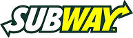 Subway has a fresh take on a wordmark logo.
Lettermark (Initials)
Lettermark logos are the simplistic version of the wordmark. Like the wordmark, this logo design contains text. The lettermark, however, only hints at the full name of the company or brand by using only an abbreviation or initials.
Lettermark logos are a benefit for:
- Companies with difficult to pronounce names
- Companies with awkwardly long names
- Companies wanting to offer an equal amount of importance to each word in their name
- Companies with names lacking distinction
- Companies already identified by their initials (i.e. IBM, 3M)
- Companies with limited branding space
A note of caution: Do not use this form of logo when the initials spell out an improper word! Sample your logo from all angles - as a word, as individual letters stated together, forward, backward and upside down. Check it out from all aspects so you know how it will be presented to your customers. Avoid the embarassment now! Also, make sure your lettermark doesn't mimic one that already exists. Be original!
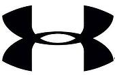 Under Armour represents in style with their lettermark logo.
Combination Mark (Text and Symbol)
This logo design is by far the most popular. According to the same study noted before, 56% of the top 100 brands have logos with both text (a wordmark or lettermark) and a symbol (a brandmark). The text is typically beside, above or beneath the symbol. The combination mark presents the customer with both the name of the company and a visual symbol to associate with it. Some combination marks are fused so that the text and symbol are always recognized as a whole. Others are more versatile, providing the same effectiveness when the logo is used either as a whole or split apart.
The combination mark works for:
- Just about any business or brand out there
- Big companies wanting a variety of branding options
- Companies with a relatively generic symbol (i.e. the star for Macy's)
- Small companies with limited budgets
The combination mark is a very cost effective logo design for businesses of all shapes and sizes.
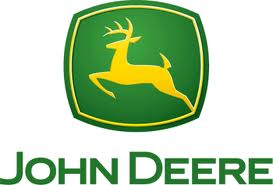 John Deere and a deer go hand in hand in their combination mark logo.
Emblem (Text within a Symbol)
The emblem logo design uses the text (a wordmark or lettermark) and symbol (a brandmark) as a single unit. Since the text is located within the symbol, the emblem logo design does not offer the flexibility of the combination mark. This design is much more compact, which can pose a challenge when trying to fit a company or business name into a small space.
We often see the emblem logo design used for:
- Companies using embroidered patches (such as political organizations and law enforcement agencies)
- Car companies using emblems on their vehicles
- Companies wanting the look of a badge or seal (i.e. Starbucks, UPS, BMW)
Be sure to test all print sizes when using the emblem logo to make sure that the text remains legible.
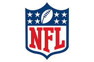 Who doesn't recognize the NFL's emblem logo? Go TITANS!
Do you need a new logo, or do you need to recharge the logo you already have? Whatever the case, our skilled designers can help you tap into the logo style that will fit your needs. Let us know which logo design you prefer in the comments below!


Leave a Reply