A recent study examined the colors used in the logo designs of the world's top 100 brands. Blue came out on top, being used in 37% of the logos. Coming in next at 27% were red and black. Yellow, grey, green, orange, silver, brown, purple and white also made the study. So what does this mean? Why are particular colors chosen for logos?
Color plays a powerful role in logo design. In fact, an infographic produced by webpageFX indicates that people make a subconcious judgement about a product within 90 seconds of seeing it. They go on to say that 62%-90% of that assessment is based on color alone. The color of a logo speaks to the customer, creating an emotional response that can alter mood, perception and even behavior. This is quite a powerful influence and, therefore, should be a priority in logo development.
A simple internet search reveals countless statistics about the psychology of color. Here are some fun facts:
- Ads in color are read up to 42% more often than the same ads in black and white.
- 80% of people think color increases brand recognition.
- 84.7% of consumers cite color as the primary reason they buy a particular product.
Based on these percentages, it's impossible to deny that color plays a major part in logo design. When starting a company, the logo design can't be based on a favorite color alone. The message relayed to the customer needs to be loud and clear. The color needs to be consistent with the product or service being offered.
Luckily, many people have taken the time to research the psychology of colors. From the data they've gathered, wonderful charts, tables and infographics have been created to illustrate the effect colors have on logo design. Here are a couple of our favorites.
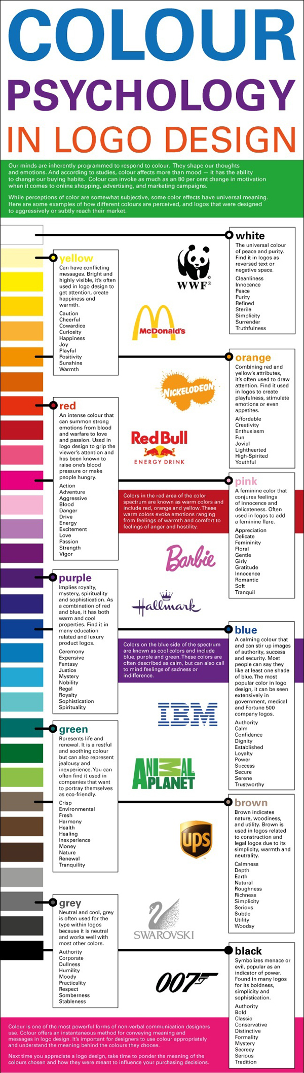
This infographic by Louise Myers shows how colors are used in logo design to influence consumers. How does your logo match up?
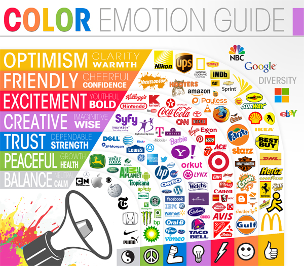
The following infographic, created by The Logo Company, illustrates the colors used for the logos of well-known brands. Do you think the emotions for these brands are spot on?
What market are you trying to reach with your logo? How do you want your audience to feel when they see your logo? Does the color of your logo tap into the emotions that will guarantee the success of your product or service? We can help you answer those questions! Let our skilled designers help you design...or even redesign...your logo so that you can send your audience the right message. We can get started today!


Leave a Reply