We've touched on the importance of logo styles and colors, but how important are the fonts used in logo design? The simple answer: VERY! The font used in a logo relays a message to the viewer. Often times there are even hidden messages or meanings placed within the font. With all of the typeface collections that exist, the task of choosing one particular font to use can be daunting. Will it make the logo memorable, original, effective...or just ordinary?
A study done in early 2014 reviewed the font styles used in the world's top 100 brands. (Yes, we've referenced this study before!) The sans-serif fonts show the most representation. Note: Sans-serif simply means that there are no small lines or decorative features at the end of each character. Out of all of the sans-serif font styles, the Helvetica typeface reigns supreme! Helvetica offers a simplicity and reliability in logo design that can't be beat.
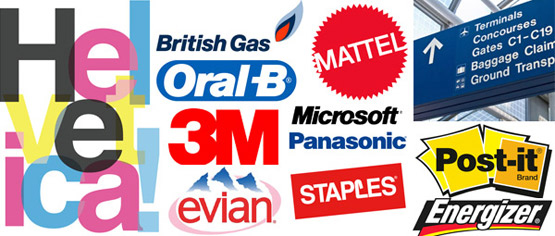 There is a good chance you see examples of the popular Helvetica typeface every day.
Photo courtesy of http://absolutegraphix.co.uk/.
Yes, Helvetica is reliable and safe, but is it the right choice for you? In choosing a font for a logo, here are some questions to consider:
- How will the font look on the product?
- How will it look on marketing materials?
- Does it look nice for all print sizes?
- Does it make the logo memorable?
- How does it look on signage?
- Will my logo only be seen online?
A simple internet search will direct you to countless websites promoting the Best.Fonts.Ever. Some of the fonts are free (check out Creative Bloq's list), and some have a price to download. Another option is to design your own. With new fonts being developed all the time, the choices can be overwhelming! So how do you choose? One thing that can help you narrow down the font options is your logo design style.
Wordmark and lettermark logo design styles offer the most flexibility. A wordmark logo provides the perfect opportunity for a handmade font, allowing the creator to really tap into the message of the product or service. For a wordmark logo, legibility is extremely important. If you only have text in the logo, you need to be able to read it!
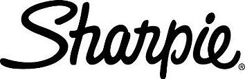 The Sharpie lettermark uses a script font style created to look like it was written with a sharpie!
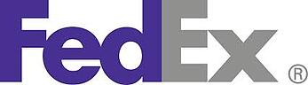
The FedEx font style includes an arrow embedded between the "E" and the "x" - a subtle message for forward motion.
There is one company that has gained success with a notoriously unreadable font: Disney. Disney's wordmark logo has a "D" that could pass for a backward "G," and a "y" that easily looks like a "p." How did Disney get away with this? Disney capitalized on the signature of its founder, the late Walt Disney; however, using such a tricky font would be a risky option for other companies.
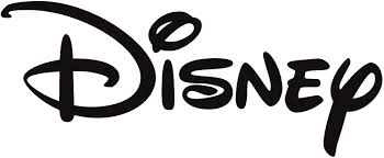 The Disney logo could be difficult to read for somebody not familiar with its iconic image.
Lettermark logos also offer a little more creative flexibility when it comes to choosing a font. Both Chanel and the Cable News Network (CNN) use custom fonts to create their iconic lettermark logos. By intertwining the "CC" for Chanel and running a line through the middle of the vivid red letters for CNN, both brands customize their logos even more to make them more identifiable and memorable.
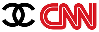 Both Chanel and CNN have iconic logos that are internationally recognized.
Simple, legible and unremarkable fonts work best for combination mark and emblem logos. With the blending of text and symbols, the fancier fonts become too difficult to read. This doesn't mean that the font can't be handmade! It just can't be too complex or fancy.
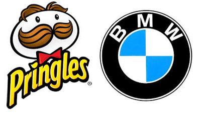
The Pringles combination mark logo (with the featured "Julius Pringles") and the BMW emblem logo use fonts that are easy to read.
Fonts are essential to successful logo design. A single font or even a combination of fonts can be used in a logo as long as it stays true to the purpose of the product or service. Embedding a subtle message within the design of the font and/or logo, like the arrow for FedEx, adds meaning and even humor to the logo design. This can take the logo from forgettable to unforgettable, from fleeting to iconic, from ordinary to extraordinary. (Stay tuned for our blog posted on the hidden meanings behind some of the most popular logos!)
Do you need a new logo, or does your current logo need an upgrade? Do you want to take it from ordinary to extraordinary? Our skilled designers are here to help!


Leave a Reply