Logos can be so sneaky. (In a good way!) Many logos of the brands you love use creative design to incorporate hidden - or sometimes sort of obvious - meaning into their logo design. Whether you are getting something to eat, taking a family outing, or even doing some Christmas shopping, you're probably viewing a logo that says a little more than just a name.
Regardless of the complexity, the hidden messages are the result of some creative genius at work. By manipulating the use of color, font style and even negative space, logos can speak to us in ways we may not even realize. They may reinforce a particular service that a company offers, hint at a company's location, or even just try to make you feel good about the product you are buying. Whatever the angle, the hidden messages make the logos more exciting and relevant to the business.
We referenced the hidden arrow in the FedEx logo in our last post. Now we are featuring another 10 popular logos and exposing their deepest, darkest secrets. Just kidding! We aren't privy to that kind of info, but we will give you some fun facts to share around the water cooler.
Toblerone
![]()
Toblerone is a product of Bern (or Berne), Switzerland - also known as The City of Bears. The mountain shown on the logo is the shape of the Matterhorn, one of the highest peaks in the Alps. Do you see the silhouette of the bear hidden on the mountain?
Tostitos
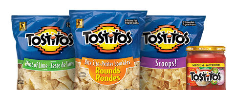
Chips and salsa...they go hand-in-hand. Tostitos illustrates the pairing with two people and a bowl of salsa. The two 'Ts' represent the people with the bowl of salsa on top of the 'I'. We all know it's more fun to share our chips and salsa.
Baskin Robbins

Baskin Robbins used color to add a little flavor - or 31 of them! - to their logo. Known for having 31 varieties of ice cream, the chain used a segmented font and two different colors to incorporate the 31 into the brand's initials.
Amazon
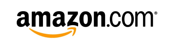
Amazon carries just about everything! To show that, the yellow arrow in the logotype points from the 'A' to the 'Z' in reference to all of the products available from the online retail giant. The arrow also resembles a smile, referencing the company's focus on customer satisfaction.
Toyota
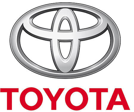
Toyota's logo, which debuted in 1990, has three strategically placed ellipses. The two overlapping ellipses represent the union of two hearts: the heart of the customer and the heart of the product. The third ellipse, making up the outline and background space of the symbol, represents the company's potential for technological advancement and the endless opportunities for the future.
Northwest Airlines
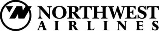
You may remember this logo, used by Northwest Airlines before they merged with Delta Airlines. The company's logo actually had two creatively hidden messages. The first, using negative space, created both an 'N' and a 'W' within the circle. The other sneaky design used the circle as an implied compass with the small arrow (or the upper left hand corner of the 'W') pointing northwest.
CISCO
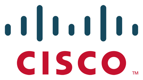
Cisco pays tribute to its roots in the lines of its logo. Originating in San Francisco, the lines represent the silhouette of the Golden Gate Bridge, a symbol of the city. The name Cisco can be seen in all lower case letters to also link it to San Francisco.
Goodwill
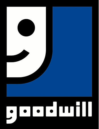
Goodwill is a non-profit that, as you've seen in the commercials, helps disadvantaged people in North America. When you look at the logo, you see a partial smiley face on the blue background. When you look even closer, you can see that it's also an enlarged version of the 'G' in the company's name. The smile is thought to reference the happiness and relief the company provides to those less fortunate.
Pittsburgh Zoo
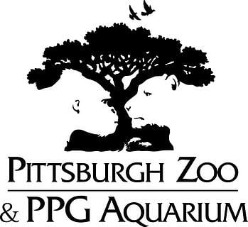
The Pittsburgh Zoo's logo shows the efficient use of negative space. At first glance, the eye focuses on the black tree. (At least that's the first thing I see!) If you look at the white space, you see a gorilla and a lioness staring at each other. The logo also uses white space to show two fish at the base of the tree.
Formula 1
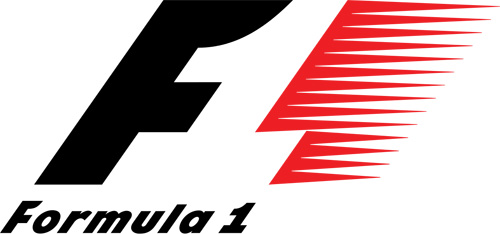
When you think of Formula 1, you think of speed, which is represented by the red pattern in the logo. This auto racing giant, also referred to by just F1, uses the white space between the 'F' and the red pattern to sneak in the number one.
These make up only a tiny sample of the iconic brands that have incorporated hidden messages into their logo designs. They show that there are endless opportunities to add a little more meaning without any more space. Take a closer look at the logos you see. You may be surprised at what you didn't notice before. If you see other hidden messages, tell us about them in the comment section below!


Leave a Reply