Color is the first thing we notice in a brand. In fact, color increases brand recognition by up to 80 percent. Think about big brands like Coca-Cola and Pepsi: they wouldn’t be the same without their iconic bright red and saturated blue colors. Color is equally important when it comes to business signage. After all, signs are your chance to attract new customers and remind old customers. The colors you choose for your signage will dictate the whole feel of the brand, so choose wisely. Here’s how to use color theory to decide the best colors for your signs. 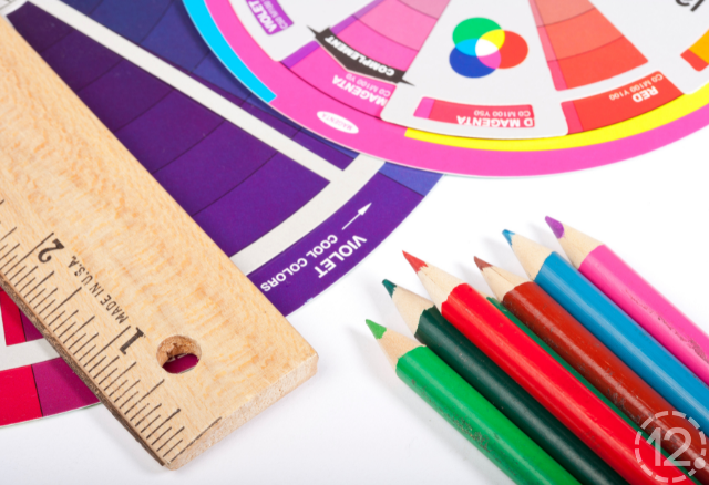
Color Symbolism
Every color has its own voice. For example, red symbolizes energy, passion, and warmth- but also danger. Stop signs and stop lights are bright red to capture the attention of drivers. Red also has an element of liveliness, which you can see in the Coca-Cola brand. Yellow and orange are also vibrant colors that exude optimism and energy. However, use them sparingly, as saturated yellows and oranges can be hard on the eyes. Soft shades of green are best for natural, eco-friendly brands. If your brand centers around health and freshness, go with green.
Blue is the world’s favorite color, which also applies to brands. Darker shades of blue are seen as mature and professional, while bright blues are confident and trustworthy. Black is a simple and sleek choice that works independently or as an accent color. White is clean, fresh, and elegant. Other colors can have special symbolism. Consider what your brand is trying to convey. If you’re selling fresh farm foods, you may go for a sage green sign. If you’re a luxury boutique, a mix of black and white would be a stylish look. 
Of course, if you already have a solid set of brand colors, think about how you can translate them into signage. Using predetermined colors takes advantage of the brand recognition you already have. However, you can tweak your colors depending on the purpose of your sign.
Color Contrast
So you have a few colors in mind now. Unfortunately, you can’t just stick two colors on a sign and call it a day. A readable sign must have contrasting colors. Signs with high contrast typically include a lighter color and a darker color. Complementary colors, opposites on the color wheel, also work well together visually. However, colors that are close in value will be hard to read. For example, yellow and purple are complementary colors with high contrast. Red and orange have low contrast because they have similar values, meaning they are both on the same level between light and dark. 
Although complementary colors are more readable than other combinations, highly saturated shades can sometimes look tacky. White on dark colors and black on light colors are generally safe bets for signage. Experiment with different color combinations before committing. You can print out possible designs and compare readability in different distances and lighting. Consider illuminated signs to add an extra pop of color to your space.
Need a little help figuring out color theory for your signs? 12-Point SignWorks has your back. Whether you’re still in the design stage or ready to build the sign of your dreams, we’re here at any step in your journey. Contact us today to get started on your next project.


Leave a Reply