When creating custom signage or vehicle graphics, it’s important to know how to select and match the colors that will best convey your company’s brand and message. Larger companies or organizations are often required to use style guides which specify exact Pantone colors for company branding. So what exactly is a Pantone color? We’ll explain the Pantone Matching System, why it’s the industry standard for printed materials, and how we use the Pantone system for the most accurate color matching.
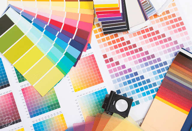
The Pantone Matching System was created in 1936 by Lawrence Herbert. He created the innovative system to identify, match, and communicate colors accurately for the graphic arts community. He recognized that colors are seen and interpreted differently by individuals, so he created a book of standardized color in a fan format, called the Pantone Matching System.
Today, the Pantone Matching System is used around the world in a variety of industries as the standard language for accurate color information. Standardized colors help ensure that designers, agencies, printing and sign companies, as well as other industry professionals, can all reference a PMS color and match it accurately for printing.
 We use the Pantone Plus Series to select and match colors for our customers.
How the Pantone Matching System Works
The Pantone Matching System utilizes a numbering system for identifying specific colors. When possible, we ask our customers to select their colors from the Pantone Plus Series palette. The coated and uncoated Formula Guide for the Plus Series currently includes 1,845 Pantone spot colors with their ink formulas. Colors in the Pantone Plus Series palette are classified by three or four-digit numbers, followed by a C or U to identify the type of surface the color will be printed on. For example, the color 293 C is a dark, royal blue color on coated paper.

How We Match Colors Using the Pantone Matching System
When we talk to our customers about color selection and color matching, we ask them to provide us with Pantone colors when possible. When a customer provides the exact Pantone colors, we can quickly print samples on our printers and verify that the colors will work for the customer prior to moving forward with the project.
Of course, many customers walk in without knowing their preferred Pantone colors. So we ask them to provide one of the following alternatives. Here are the types of samples our customers can provide for color matching:
- CMYK mix
- previously printed branded materials (business cards, brochures, etc.)
- name-brand paint swatches (or color names)
- wall coverings
- carpet samples
- other items with preferred color
When customers bring us one of the items mentioned above, we look through the Pantone Formula Guide to identify the closest matching Pantone colors. If we find a few different colors that are similar, we will print the closest color samples and ask the customer to select their preferred color. This is the method we use for the majority of our projects.
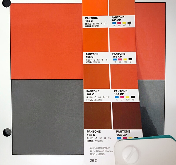
 The orange color in this swatch was provided by a client. We used the Pantone Matching System to find the closest orange Pantone color for printing.
Pantone Color of The Year
On occasion, we run into customers who have no idea what colors they would like to use in their branding and ask us for suggestions. We often explain that they should think about how color will convey their message. One fun way to select unique, popular colors is to look at Pantone’s Color of the Year from this year and previous years to learn about trending colors and color psychology.
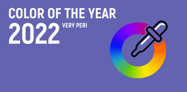
The Pantone Color of the Year for 2022 is Pantone 17-3938, or Very Peri. According to Pantone’s website, it is a “color whose courageous presence encourages personal inventiveness and creativity.”

When Pantone announces its color of the year, industries pay attention. Pantone’s Color of the Year helps individuals better understand color and its ability to convey deep messages and meanings.
So now that you know more about how we use Pantone colors for color matching when creating custom signage and vehicle wraps, why not bring in your color samples and ideas to see what we can create for you? From custom signs and advertising wraps, to architectural displays and wall murals, we offer a wide range of custom products for your company or organization.
To get started on your next project, give us a call at (615) 595-6564 or click on the button below. We are located in Franklin, TN, but we also serve Nashville, Brentwood, Hendersonville, Murfreesboro, Lebanon, and Spring Hill. We look forward to hearing from you!


Leave a Reply