We've all been in this situation: You're driving somewhere, and a sign catches your eye. You glance over to see it, but it's too late! You missed the important information on it. Do you turn around? Do you wait until the next time you travel down that road? Do you just forget about it and move on? For most of us with busy schedules, we would probably answer 'yes' to the last question. Life is hectic, and we often just move on. For the business advertised on the exterior signage, unfortunately, this represents a missed opportunity.
With custom outdoor signs, it's crucial to get the timing right for everyone, including people on foot and in vehicles. What may be easy for a pedestrian to read could be a big blur to those driving by. The signs need to work for everyone. People need to do more than just see it - they need to be able to read it. So how can you make sure they can?
I thought about this when we recently installed a 55" monitor on a wall in our shop. In my home, a television that size looks pretty large in my living room; however, the monitor seems so tiny on the tall, open space in our shop. That's how the lettering on signage works too. What may seem "big enough" in thought or up close becomes visibly smaller when mounted outside or at a distance.
In the photo, the words on this sign look HUGE, but they don't look nearly as large when hanging on the side of a large brick building. It's always best to stick with basic information on outdoor signs - just enough to give the viewer the information needed.
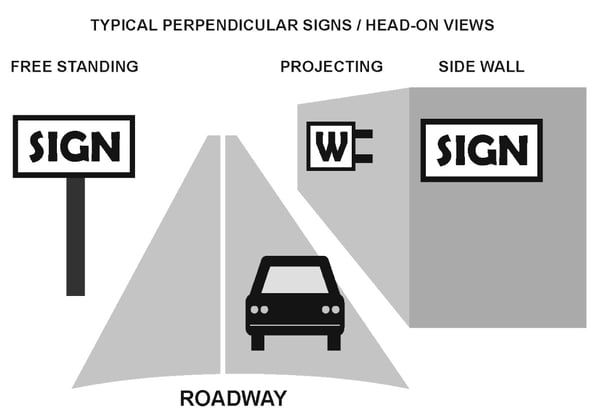
The United States Sign Council (USSC) offers wonderful guidelines in their Sign Legibility Rules of Thumb. (Too much for me to review here!) In this document, they describe the perpendicular signs that are most commonly used outside: free standing, projecting and flat signs on buildings. The image below, courtesy of USSC, demonstrates these signs configurations in relation to a vehicle traveling by them.
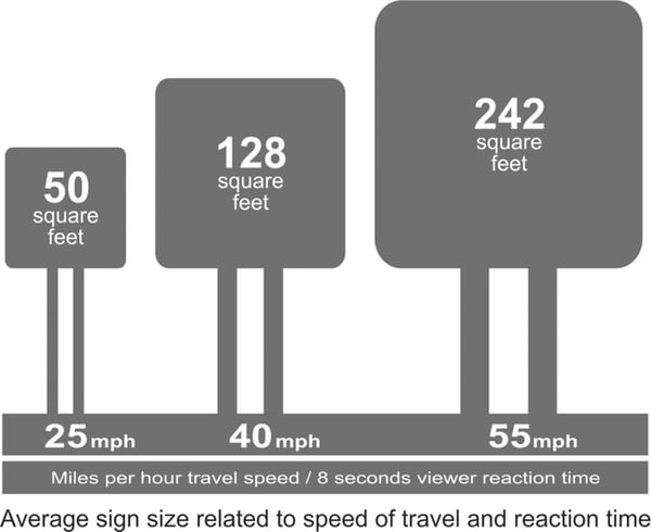
Another wonderful graphic that they use in the document shows the recommend size of a sign based on a moving audience and a reaction time of eight seconds, which is the minimum amount of time that the USSC deems necessary for those in vehicles to read and comprehend signage.
Now this may sound more complicated than it needs to be! Our team members are highly qualified to recommend exterior sign designs that will maximize viewer engagement. That's our job! We always consider the best layout that will provide you with the most exposure, and we do it in conjunction with proper city or county permit requirements. All you need to do is provide your location, logo and/or idea, and we can do the rest.
Here are some examples of exterior signage we've fabricated for clients in Middle Tennessee. As you drive around, you may notice some of these. Did you have time to read all of the information on them?
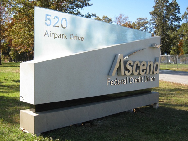
The letters on this Ascend monument sign have different thicknesses and heights; however, they are all tall enough to be seen from at maximum viewing distance of at least 110 feet. The USSC provides a methodology for calculating sign size and letter height in their document. Obviously, a number of factors can influence the viewing distance and recommended size of a sign (i.e. location, weather conditions, tree growth, landscaping, adequate lighting, etc.).
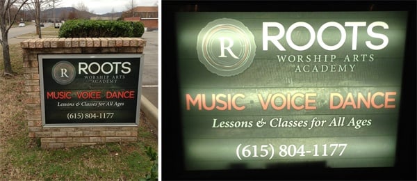
This monument sign for Roots Academy on Seaboard Lane in Franklin has a lit component that offers better visibility during evening hours.
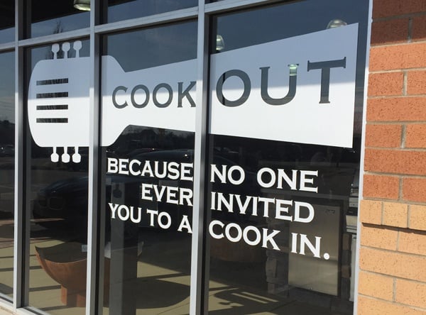
From a distance, these window graphics will catch the eye of a car rider and make them think about grilling season! Hopefully they will remember the graphics and venture into Embers Grill and Fireplace Store on Moores Lane to check out what they have to offer. Mission accomplished.
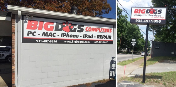
Big Dogs Computer Services and iPhone Repair on Main Street in Spring Hill has multiple signage options that viewers will notice while driving by.
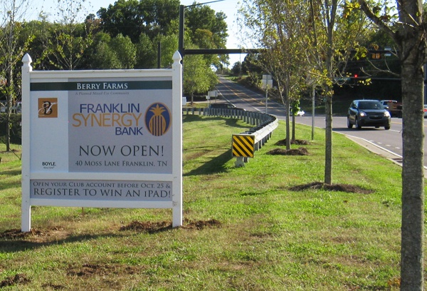
You needed enough time to read about the chance to "register to win an iPad" on this post and panel sign for Franklin Synergy Bank in Berry Farms. If the letters were too small, the cars driving by on Lewisburg Pike would have missed an exciting opportunity.
If you're into the science behind viewer reaction time, speed of travel, copy area and negative space, you will love the Sign Legibility Rules of Thumb from USSC. If that's not your thing, we've got you covered! Contact us today to discuss your next outdoor signage project, and our team will ensure that people will see and read it! You can reach us at (615) 595-6564, stop by our shop or click on the link below.




Leave a Reply