It's the time of year when the stars come out in their fanciest garb for the big award shows. (Ok, some seem to struggle with the fancy part!) Fans from around the world make predictions for the big winners in film, television shows, music, and more. Even our major sports teams get in the mix, with the Super Bowl and various All-Star events being held during awards season. What do all of these lavish shindigs have in common? Well, a lot of things! But in keeping with our industry, I'll stick with this one: step and repeat wall graphics.
You may be wondering what it means to have step and repeat wall graphics. They are the sponsor walls that line every huge event where photographers and members of the media will be present to capture photos and videos of important people. The walls include sponsor and event logos that create prime advertising opportunities. If you are a fan of awards season, you've seen your fair share of step and repeat backdrops over the last two months!
When you work in this industry, you pay close attention to signage everywhere you go. (Or maybe that's just me?) Awards season graphics are at the top of the list. Being that so many shows and events happen in such a short period of time, it keeps the graphics fresh on the mind - and much easier to critique! We've had fun in the past analyzing these banner backdrops, and this season has not disappointed either. In my opinion, some backdrops are winners, and some could use some updates. What do you think?
The 42nd People's Choice Awards (01.06.2016)
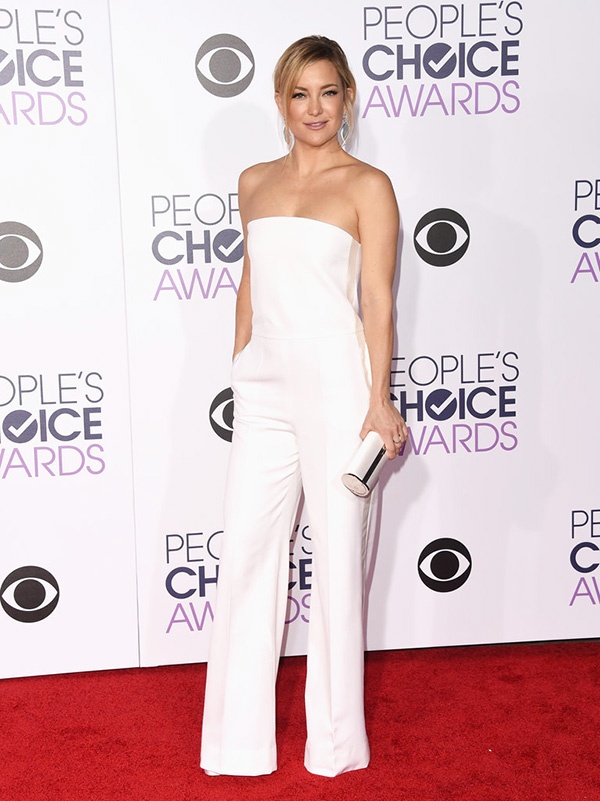
Photo credit: of PopSugar.com
Maybe it's just me, but Kate Hudson can make anything shine - even when she blends with the white background of this backdrop. The People's Choice Awards has used the same step and repeat since 2014. The backdrop in 2013 was relatively the same, but the logo for CBS was a bit different. It had a blue brandmark that didn't look as classy as the simple black of the current design. The two repeating logos have good placement and size that provide effective advertising and balance in photos from all angles. (You will notice the difference in spacing and size as we move along.)
The 73rd Golden Globe Awards (01.10.2016)
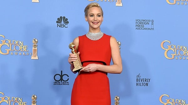
This banner backdrop has welcomed stars at the Golden Globe Awards for many years. The logo design has remained the same, as has the periwinkle blue color. I can't say that it's my first choice, but it's worked for the event for a long time. The logos seem a little spaced out, so at times only a portion of the Golden Globe combination mark or the other sponsor logos make their way into the photos. The blue background could be considered a winner or loser, depending on the color of the dress in front of it. Jennifer Lawrence and her red dress definitely stand out, but (let's be honest) she will attract cameras in front of any background!
The 22nd Annual Screen Actors Guild Awards (01.30.2016)
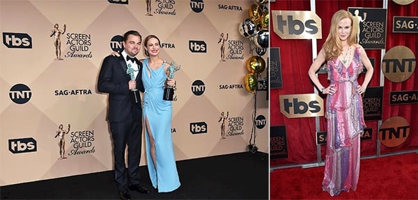
Photo credit: Getty Images
The backdrop on the left continues to show subtle changes from year to year, and I have to admit that this year was better than the rest! The sponsor logo designs have changed - maybe they took a hint from our blog post about it in 2014! Brooke was spot on about the murky yellow color and the white outlined logos from that year. The crisp black logos in this design are much classier, and the color seems to be a little more subdued. I like the diamond pattern in it that adds some texture, connecting the perfectly sized logos to one another. Brie Larson's dress adds a much needed pop of color and actually blends perfectly with her and Leonardo DiCaprio's statues!
As for the photo on the right, this is a twist on the standard material used for typical banner backgrounds. This uses an open structure with a red curtain background. The sponsor and event logos are individual signs attached to the structure to create the same repeated pattern in a dimensional style. Fancy-schmancy all the way! Nicole Kidman doesn't look too shabby in front of it either!
The 58th Annual Grammy Awards (02.15.2016)
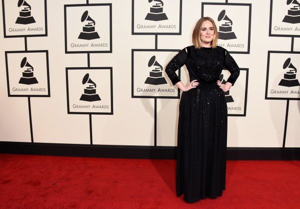
The design for the Grammy Awards has been the same since 2014, when it made its debut switch from a gray background and white gramophones to the white with black you see above. Similar to the People's Choice Awards, this color combination works well and presents a neutral backdrop for the often outlandish outfits that drop by. The logo size is on the large side, but it works for this event. It's the perfect setting for Adele as she walks the red carpet and stops for the paparazzi.
NHL All-Star Skills Competition (01.30.2016)
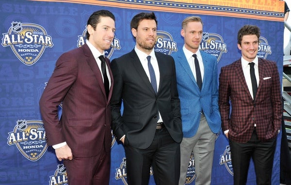
Our city hosted this year's NHL All-Star festivities, and some of our Nashville Predators came out for the Skills Competition at Bridgestone Arena. James Neal, Shea Weber, Pekka Rinne, and Roman Josi walked the red carpet - complete with an all-star step and repeat backdrop. The banners aren't limited to just Hollywood. We see them from press conferences before and after games to all-star events. I'm a fan of this pattern since it represents our city! The logo was revealed in May 2015 and generated a lot of excitement for Music City's first time hosting this event.
5th Annual NFL Honors (02.06.2016)
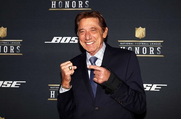
The National Football League has stayed course with their classy dark background and crisp logos. After looking at so many step and repeat designs, I've decided the dark background color is my favorite. It adds a richness and elegance to the look, and the logo designs are perfectly sized and placed. This one is worthy of a football legend like Joe Namath standing in front of it!
Disney's Zootopia Hollywood Premiere (02.17.2016)
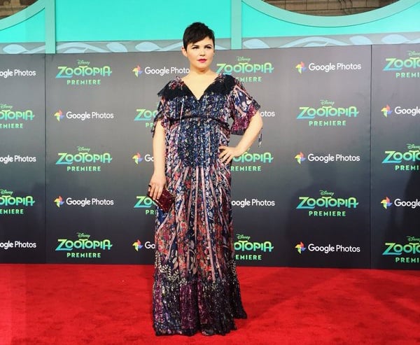
The red carpet works for movie premieres too! Again, I am a fan of the dark background used for the Hollywood premiere of Zootopia at the El Capitan Theatre. The black base allows the colors of the logos to pop and coordinate with the deep red carpet and turquoise accents. This one is another winner for logo size and placement! It could seem too busy or wordy, but it just works. Ginnifer Goodwin and her cute baby bump look stunning in front of it. I'm partial to this one because I have a family member in the movie! If you see it, watch out for Benjamin Clawhauser at the Zootopia PD!
Have you gotten some great ideas? I hope so! Banner backdrops aren't just meant for the rich and famous. They can be used for corporate events, weddings, anniversary parties, and birthday celebrations. If you have an event coming up with photos involved, a step and repeat wall graphic could be just what you need! Contact us today at (615) 595-6564 or click on the link below to get started.


Leave a Reply