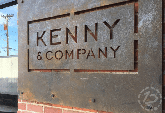
Corten steel architectural signage customized with a rustic look for the historic Oak Barrell Building in Nashville, TN.
Have you ever driven through a new city only to be stopped in your tracks by the signage of a business or building? We're not talking about a flashy neon OPEN sign or the iconic Golden Arches. We're talking about the kind of building that catches the eye because of signage that not only stands out but blends in as well. The type of business signage that combines the architecture of the building itself with the company's brand and logo in a seamless and eye-catching way. That's architectural signage, and these are some of the most eye-catching elements used to grab your attention.
Metal
Of course, metal is first on the list as it tends to be the basis for most business signage, architectural or otherwise. However, the right metal can make all the difference when it comes to a beautiful and long-lasting sign piece.
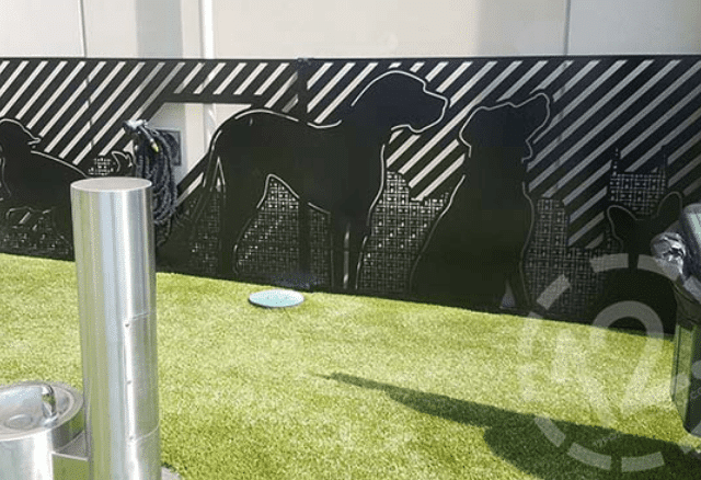
Aluminum is one of the most popular choices since it's lightweight, machinable, and naturally corrosion-resistant once exposed to air. The versatility of aluminum is what makes it valuable as a sign-making medium. It can be precision cut into shapes or logos like these super detailed (and utterly adorable) architectural panels we made for the furry residents of SkyHouse.

These custom decorative panels were made by using a waterjet to precision cut the design into aluminum.
Another strong metal that comes with built-in anti-corrosion properties like aluminum is stainless steel. Both are strong and silvery but can transform completely when different finishing techniques, like polishing or rough brushes, create a swirl pattern in the metal.
Brass and copper have been around for a while because of their gorgeous colors. The only negative (to some) is that they both will form a patina over time that will change their color in different ways. Brass tends to turn darker, while copper develops a green color when exposed to the elements. You can coat brass with a sealer to prevent this, but most people tend to like the color changes that come with copper in outdoor installations.
Architectural Mesh
Technically, we could have included architectural mesh in the metal section above, but we felt it deserved its own section for two reasons: 1 - It's not something we've personally ever worked with before, and 2 - It's used in entirely different applications than your typical everyday commercial signage.
The name "architectural mesh" itself doesn't sound like it would be very aesthetically pleasing. Sure, these mesh panels start as just that: a panel of interlocked metallic wires often made out of a stainless-steel alloy. But that's where the artistry comes in.
Paint can be applied directly to the mesh itself, turning it into a canvas for whatever creative artistry the company has in its collective mind. Add in the fact that it's lightweight and vented; the architectural mesh can cover the entirety of a building, including a parking garage, thus turning the whole place into a work of art.
Not to mention the option of adding illuminated architectural mesh! During the day, the mesh lends an attractive industrial appearance, while at night is when the real magic happens. Companies can customize the programming on the lighting displays with any color imaginable and lit from various directions to create a stunning display that is sure to catch even the most distracted of passers-by.
Typography
Typography in signage is one of the most unique architectural elements out there, but in our opinion, we haven't seen enough of it. We don't mean just putting the company's name up there in a boring font and calling it a day either. We're talking about the giant LAX signs that stand at the Los Angeles International Airport entrance. Or the House of Terror Museum in Budapest, Hungary that has the word TERROR shown on the building as a shadow from a cutout overhang above.
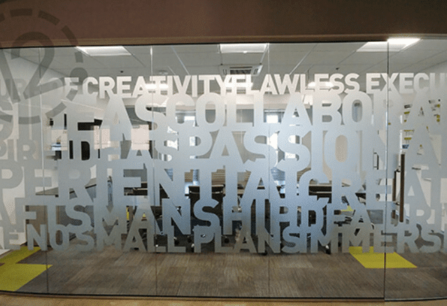
That last one is an emerging trend of illusions using typography that we love to see. It's interesting and engaging and forces the viewer's attention to stay just a few seconds longer to truly comprehend what they're seeing. We used inspiration from illusions and typography to create an etched glass effect with vinyl that can be used on glass doors, windows, and even mirrors. It may look like you spent thousands of dollars having all the doors and windows in your office laser etched with your custom branding, but in reality, it's a much more cost-effective option.

This vinyl application gives the appearance of etched glass without breaking the bank.
Illusions are often used in wayfinding signage as well, including Tokyo's Haneda Airport. To ease tourist congestion, they added 3D rendered directional arrows that appear carved out of the floor. Doing so also cut down the need for standing signs which ended up as obstacles for the visually impaired or those with strollers or tons of luggage.
When it comes to business signage, the easiest way is to throw your logo up on a white backlit background and call it a day. But don't you want to make an impact? Don't you want people to remember you? Don't you want potential customers to come inside and see what you're all about JUST because of how cool your storefront or brick-and-mortar location looks? Let 12Point SignWorks work with you and your team to put some (or all) of these elements into an architectural signage campaign that catches your fair share of eyes.


Leave a Reply