Brand consistency is important to every business, large or small. The most memorable brands are easy to recognize, because they use the same logo, fonts and colors across every marketing medium. So how do you ensure your brand appears exactly as it should in your custom signage? We recommend that you develop a style guide.
 Our own style guide is simple, but very informative.
Whether your brand will appear on a computer screen or on a sign, mural, billboard or vehicle wrap, it’s important for the look, feel and colors to be consistent. A brand style guide is a document which provides graphic designers, web developers and other publishers a set of specific guidelines about how your brand should be reproduced.
Style guides can be simple or very complex, depending on the size of your business. If you’ve recognized the need for a style guide for your company or organization, a good rule of thumb is to include at least the following:
Logo
You should provide a visual representation of all the variations of your logo. For example, we have a smaller version of the 12-Point logo that includes only our brandmark. It fits well on most mediums. We also have another version of our logo that includes our full company name.
![]()

Logo Rules
A style guide should contain a detailed set of rules for logo usage. Rules can include sizing, placement and how much clear space is needed around the logo.
Colors
Color consistency is extremely important when other companies reproduce your logo. Colors require different values and settings on various printing processes and devices. So it’s important to include both print and screen equivalents.

For printing, we need to know the CMYK mix for your brand colors. You can also provide us pantone colors, however CMYK is best for printing custom signage. The Pantone Plus Color Bridge is the most recent version of the pantone matching system.
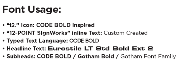
Typography
Typography refers to the fonts that are included in your logo. Your style guide should list your primary, as well as any secondary fonts that are permissible to use with your logo.
As you can see, a style guide is a very useful tool that can ensure your brand is always printed or used in a cohesive and professional way. If you have questions about logo design or style guides, give us a call at (615) 595-6564, click on the button below, or come by our shop for a visit. We would be happy to help!
We’re a sign company located in Franklin, TN, but we serve all of Middle Tennessee, including Nashville, Brentwood, Hendersonville, Lebanon, Smyrna, Spring Hill, Columbia and Murfreesboro. We specialize in vehicle wraps, environmental branding, lobby and logo signs, wall murals, window graphics, architectural displays, event signage, trade show displays, and custom projects. We also ship our custom vehicle wraps and signage products to addresses in the US and Canada.


Leave a Reply