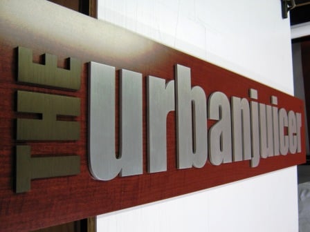
This week we constructed a logo sign for a local company opening up juice bar locations in middle Tennessee. The customer wanted to have an industrial, modern look to the sign, yet keep it classy and subtle. We began with showing the client some different substrates for their sign project. After looking at various acrylic and aluminum lettering solutions, we decided on the aluminum lettering. When building a dimensional logo sign, the mount location, panel, and depth of the sign all need to be considered.

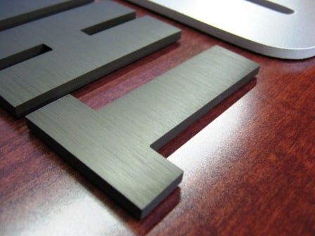
For this particular sign, we chose to go with 1/4" thick flat cut aluminum lettering cut to the company's logo standards. To take it a step further and add some creativity, we took the "THE" lettering in thei logo and had the aluminum anodized to look like a medium oxidized metal color. This sets the standard brushed aluminum lettering apart from the rest of the sign, allowing it to stand out. The "TM" on the logo was applied last to the panel using a semi transparent dark vinyl, similar to the color of the anodized letters.

Once everything was mounted and applied to the wood panel, the sign was ready to be reviewed and picked up by the client. Upon review, the client was extremely happy with the end result, and especially liked the anodized brushed aluminum letters as an added touch. The project was a success, and we look forward to doing more of these logo signs for this client in the future.


Leave a Reply