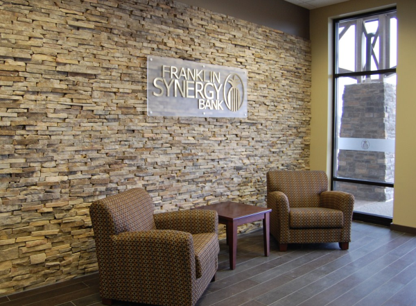
The opening of Franklin Synergy Bank's new Spring Hill TN Loan Production Office required new exterior and interior signage. One part of this project scope was to design a dimensional logo sign suitable for use on a stacked stone feature wall inside the office space.
 Dimensional logo sign with brushed metal face on frosted acrylic panel
In other branches and offices built out by Franklin Synergy Bank, we have created dimensional logo signs that are individual pieces fastened directly to the wall. The flat cut metal logo sign shown below is an example of this previous style.
 Flat cut metal dimensional logo sign fastened directly to the wall with a slight standoff distance to create a gap for visual effect
In the case of the Spring Hill office, the feature wall already had the stacked stone built in from a previous tenant. Rather than struggle with several dimensional logo and letter pieces on the uneven stone face, we proposed that the logo be fastened to a frosted acrylic panel that in turn could be fastened to the wall with only 6 connection points (architectural display hardware called "standoffs"). We recommended the frosted acrylic panel to visually separate the stone from the dimensional logo so as to accentuate the logo relative to the stone.
 The dimensional logo sign for Franklin Synergy Bank's new Spring Hill office hanging over the client waiting area
Although not evident in the photographs, one additional feature in the sign construction is the use of a blue acrylic layer behind the brushed gold on the faces of the dimensional logo and letters. Franklin Synergy Bank's colors are blue and gold, and the use of the blue behind the gold really created a beautiful combination that the client loved (and we thought it looked terrific too!).
Be sure to check out examples of other indoor logo and lobby signs on our website pages!


Leave a Reply