Last week we had a lot of fun putting up custom wall graphics, wayfinding signs, and vinyl and acrylic lettering for Interior Design Services (IDS) over in Brentwood, TN. We didn't design the graphics, but we printed and installed them. The design came from Birdsong Creative, a group we've partnered with on several other projects.
Interior Design Services is really great at promoting green and sustainable design practices. Part of this includes a furniture upcycling program where furniture is reused and redesigned instead of being thrown out. For this department, we put up the word "upcycle" in acrylic letters and the rest of a slogan in cut vinyl letters. We actually printed the word "upcycle" in vinyl so we used the vinyl letters as a template for where to place the acrylic letters.
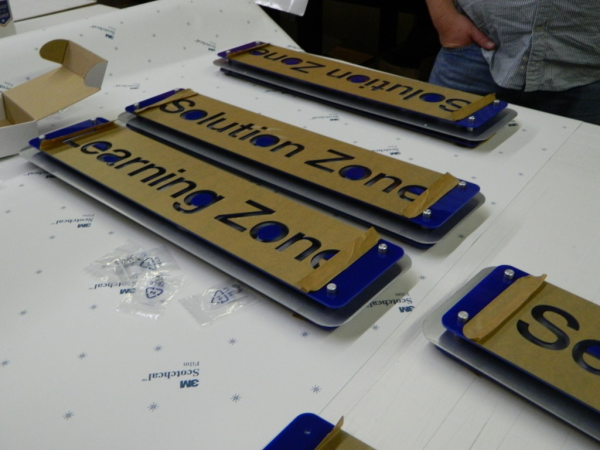
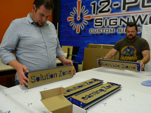
The next elements we installed are what IDS calls their "street signs." These are metal and acrylic wayfinding signs that indicate different departments within the building. For example, they have a training center called the "Learning Zone" and another department called the "Solution Zone."

Here they are back at our mad scientist lab. We kept the paper on the front of the acrylic until we installed the signs to protect the face of the signs and keep our smudgy fingerprints off of them.
We made these wayfinding signs by placing a cut blue acrylic face on top of a metal backer with standoffs. The signs were then hung from the hanging cable systems we often use in architectural displays. Because the ceiling was made of a grid of tiles, we had to get creative with some washers to make sure the signs were secure. If we just drilled the cables into the tiles, they would be really easy to knock down. The solution? The guys took a 3"X3" pad of acrylic and put it on the other side of the ceiling tile. They then drilled through the tile into the acrylic and cushioned either side with washers. The cord was threaded through the ceiling tile and through to small acrylic piece on the other side. This provided extra (invisible) support so that the signs would be more secure than they otherwise would be. The ceilings in another hallway were just metal grids without the ceiling tiles so we drilled directly into the grid, making it appear if the signs were just floating and hanging on nothing, but they were actually really supported.

Chuck and Mike eyeballing the signs to see if they are level and good to go.
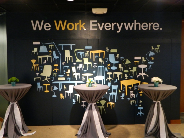
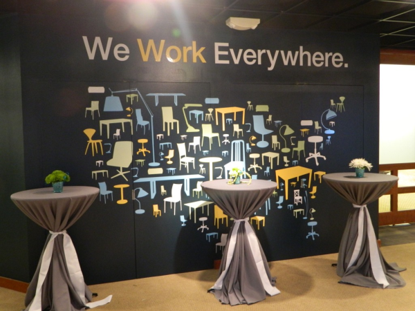
Our favorite signage that we put up, though, is the mural of cut vinyl graphics we installed for them in their lobby. Birdsong Creative's design was inspired to use the shapes of the furniture IDS uses for its clients. The furniture shapes were then cobbled together to create a sort of mosaic of the United States. It turned out really great!

Isn't it a cool design? Kudos to Birdsong Creative for coming up with it!
We printed off the different sizes of furniture graphics on vinyl and then weeded off the excess vinyl. Although there were some really detailed and thin strips of vinyl, it wasn't too difficult to weed. The biggest challenge with this mural was installing it on the paint in IDS' lobby. Vinyl can have a tough time sticking to any latex paints, fresh paint, or any low VOC (VOC stands for Volatile Organic Compounds) or zero VOC paints. These types of paints tend to continue to emit a gas that lifts the vinyl and makes it difficult to adhere it to the surface. They were redoing the design of their offices so the fresh paint just may not have had enough time to cure properly. But, all is well! We were able to get the graphics on anyway. It was just a little slower going than usual.

We thought this was a really great example of a company carrying its brand throughout different types of signage. It was cool, modern, and unique and they used a variety of signage methods to do it! Interested in learning more about wall graphics? Download our free white paper to read about what you can for your business.
Or, if you're already interested in getting a wall wrap, click the button below to contact us and get a free quote on your project!


Leave a Reply