Hey fellow Franklin-ites! (Or Nashville, Springhill, and Brentwood-ites for that matter...) have you tried out Kate's Kitchen in Cool Springs, yet? It's a local cafe with a "French twist." Kate's Kitchen is one of several restaurants from the Strawn family of restaurants that includes such local favorites as MacK & Kate's, Macke's, m. market, and M. Restaurant and Bar. MacK & Kate's was even written up in Southern Living magazine as one of "7 Nashville Restaurants You Gotta Try!" Jan and Bernie Strawn have only been restaurateurs for less than a decade but already their variety of restaurants named after their two daughters, Mackenzie and Katherine, have been receiving lots of acclaim.

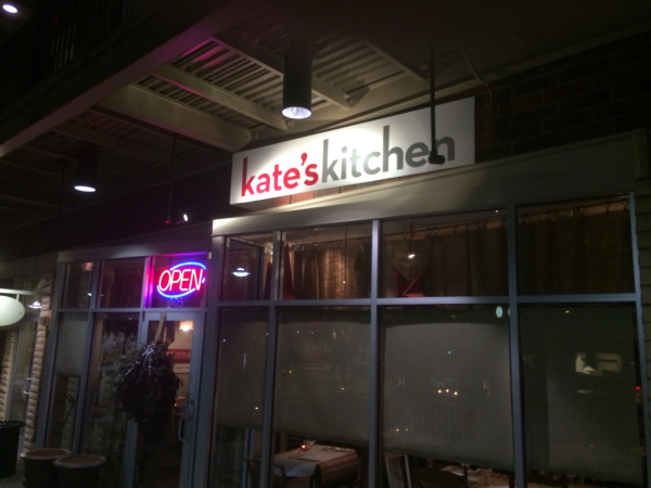
View of the restaurant sign and storefront. We were mimicing the slanted shape of the window panels in our placement of the outdoor sign.
Kate's Kitchen is a slightly more casual take on their usual upscale style of Southern comfort food—and with an added French twist! Husband and wife team of Alain and Tracy Treville work as chef and pastry chef respectively. Alain was formerly a chef at the Cafe de Paris and Tracy is a true French pastry chef having recently worked in Paris and at The Four Seasons. You can look for delicious beignets (I mean...you can't go wrong with beignets for breakfast), crepes, soups, salads, and sandwiches among other delightful dishes.
 This is a great font and color choice for this size of sign. They are highly visible because of the thickness of the font, the hot red color, and the reflective quality of the silver.
This last week we put up a new outdoor sign for Kate's Kitchen! The restaurant sign is a flat, 1/4" ACP panel that we offset at an angle from the wall to mimic the shape of the window panes below it. To do this, we custom made aluminum brackets that asymmetrically pushed the panel away from the wall behind it.

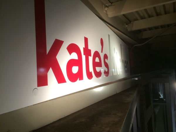
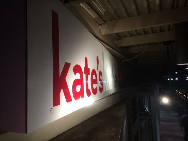
See how the sign is angled? It also creates visual interest because it appears to be more dimensional than it is.
The lettering on the sign is high performance vinyl in silver and red that will resist damage from the elements and cling aggressively to the sign. Overall we felt this project was a good example of balancing the budget, the client's needs, the building owner's parameters, and the city code.
Looking to get your own sign for a restaurant? Call us today or click the button below to get a free quote and get the conversation started.


Leave a Reply