Westhaven is a planned community right here in in our hometown of Franklin, TN that truly embodies all of the charm and love of history of our city. It's a community with homes, businesses, and a golf course that are all carefully planned to create a universally beautiful and nostalgic atmosphere.
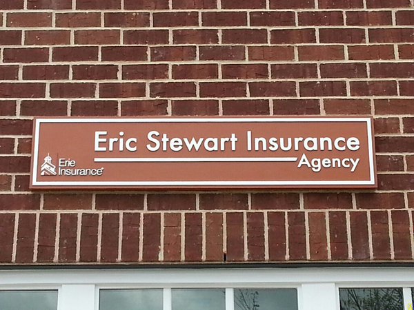
Eric Stewart Insurance Agency contacted us because they wanted to get an exterior logo sign for their Westhaven location. We've done some work for Eric Stewart Insurance before—including a vehicle wrap on a jeep—and have loved working with them so we were excited to work on another new project for their brick and mortar location!

Eric Steward Insurance Agency's sign has a classic, clean look that fits in well with the community at Westhaven.
Every city will have specific codes that they require all signage to meet. Because Franklin, TN is a city that is renowned for its sense of history and quaintness, the rules can be pretty stringent to help shops maintain the appealing and high-quality exterior that makes them look like part of "America's Favorite Main Street." Westhaven takes this effort to brand themselves a step further than the city by requiring every new sign to be approved by their own planning committee as well as by city planning. The committees authorize the type of materials, size, and look of each sign that's allowed to be put up. Because they really care about their community, every detail needs to fit their brand and image. It's this attention to detail that makes it such an attractive and well-maintained area!
With this criteria in mind, we went about creating a sign that was unique to the insurance company, incorporated their logo, and also fit in well with the surrounding businesses. To do this, we chose to make their sign out of a 15-pound sheet of urethane foam. The logo and letters are routed in bas-relief of the panel as a whole to give the sign a little bit of dimension. The foam is painted to imitate wood, but it's actually a lot better than wood for signage because it will hold up better over time. Wood signs can take a lot of maintenance because they frequently need to be recoated with protective sealants and can errode over time due to exposure to the elements. The urethane foam doesn't ever need to get recoated and it won't absorb water the way a wooden sign wood.
The sign is only 1.5 inches thick and 54 by 12 inches in area. In the end, the sign conveys everything it needs to without any extra fluff. The crisp, clean look of the sign fits in well with the Westhaven community and has a classic feel that will keep it in-style for years to come.
Looking for your own exterior logo sign? Click the button below to get a free quote and consultation on your project!


Leave a Reply