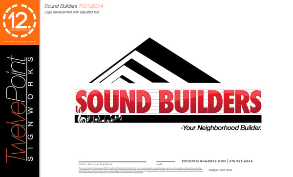
We were approached by Sound Builders, a construction company based in Nashville, to design their business logo. Rich, our Senior Art Director, met with the owner, Robert, to get a feel for the project and to find out answers to some key questions of logo design: What does Robert want to accomplish with the logo? Who does Robert want to reach?
At the meeting, Rich learned that Robert primarily wanted to incorporate the essence of Nashville into the logo - Music City, The Nashville Sounds, country music. Robert would like his company to establish deep roots in the Nashville community and feels like the Sound Builders logo is a perfect starting point. About a week later, the Sound Builders logo was complete!
 The logo for Sound Builders in Nashville, TN.
So how did Rick accomplish this in a week? He started by simply talking with Robert. In getting to the heart of what Robert was looking for, Rich gained a true feel for the company's mission in staying rooted in the Nashville area community. From there, he developed three different logo concepts, using three different styles: corporate, abstract, and playful. The creation of the three initial concepts took about three days. (Three must be the key number in logo design!) The variations in the logo design offered elements that Robert could then choose from and combine or even completely eliminate. By pulling the font style from one concept, the general direction of another, and elements from the third, Robert was able to give Rich all of the information that he needed to create the final logo. Two revision rounds later, and the project was complete!
There is so much incorporated into the Sound Builders logo! First, the logo ties the company to the city of Nashville. The music notes and the music bars behind the Sound Builders name pay homage to Music City, country music, The Nashville Sounds...all things Nashville!
 Musical notes and music bars add the Nashville touch to the Sound Builders logo!
Next, Rich added the icon on the top of the logo, which represents roof lines. This provides a clean and subtle reference to the business itself.
 The icon at the top of the logo represents roof lines for Sound Builders, tying in that it is a construction company.
The final touch that Rich incorporated into the logo is the company's slogan - "Your Neighborhood Builder." The slogan suggests two meanings: Sound Builders is a local company within the neighborhood or community of Nashville, and Sound Builders works with homeowners as a residential construction company. The slogan separates Sound Builders from commercial builders and continues to establish those deep roots in the Nashville community.
 The slogan of Sound Builders adds a personal touch to the logo design.
Once the logo development process was complete, Robert was ready to move on to marketing materials. Rich designed catchy business cards with the logo that are sure to get noticed! The business cards were part of a logo development package that we created that included marketing materials. This package can be customized based on what the customer needs.
Are you interested in logo development for your business? Let's talk about it! Conversations can happen in person, by phone, or even by email - just not snail mail! (Well, I guess we could use snail mail but that would take way too long!) We also appreciate seeing photos or other logos that appeal to you. Basic logo packages start at $500, but we can delve even further into full corporate branding. And don't forget that we make office, building, lobby and logo signs! We can customize the project to fit all of your needs.
If you are ready to get started, call us or click on the button below for a free consultation to get started on your logo development!


Leave a Reply