We had the pleasure of designing and installing signage for the new Franklin Christian Academy (FCA) campus. The vision, or the three pillars, of FCA is to provide challenging academics, life-giving community, and transforming discipleship. Since 2009, the school has had the distinct honor of being the only accredited Christian middle and high school in Franklin, Tennessee. FCA encourages and fosters service opportunities within and outside of the school's close-knit family. They are so excited about their new building, which will help them continue to foster their Christian world-view curriculum and servant leadership training.
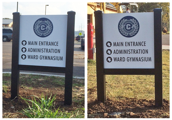
We created and installed signage for four different areas of the school. The first project we designed and installed was directory signage for the school grounds. The signs direct visitors to the Main Entrance, Administration, and the Ward Gymnasium.  Directory signage is a great way to help visitors find their way at the new FCA campus.
For these signs, we used 3" black aluminum single rail post and panel sign frames. We digitally printed and laminated the FCA logo and directional elements and then installed them on the 1/4" thick ACP sign boards. These signs are very durable and will withstand any changes in weather.
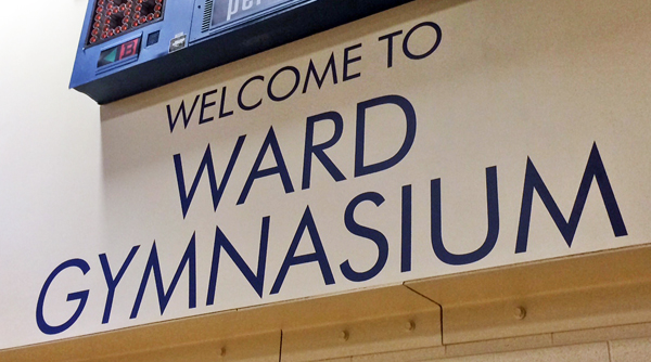
Our next project was to fabricate and install lettering for within the building, specifically around the gymnasium. Underneath the score board, we installed navy blue vinyl letters that spell out WELCOME TO WARD GYMNASIUM. The letters were plotter cut and mounted onto the dry wall in the gymnasium.
 At over 3 feet tall and 9 feet wide, you will feel welcome when you enter Ward Gymnasium!
We also installed 1/4" thick laser cut acrylic letters above the doors to the gym in the Main Foyer. The dark navy blue letters are adhesively joined to the brick wall above the doors.
 The navy blue acrylic letters really stand out against the white brick wall in the Main Foyer.
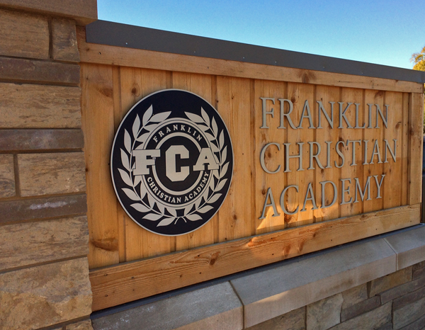
The exterior monument logo sign was the most noticeable project we installed on the FCA campus. With the wood face and masonry already completed, we created the lettering and the logo plaque that we positioned on both sides of the monument sign.
 The cut aluminum letters and the laser etched plaque are striking on the wooden face of the FCA monument sign.
For the school's logo, we designed a 23" by 23" circular aluminum plaque. The plaque was laser etched with the school's logo, and then we used navy blue (PMS 282c) as the background fill color. The navy blue fill color really makes the aluminum face of the logo stand out. The school's name is comprised of 1/4" thick flat cut aluminum letters. The letters are almost 6 inches tall, which makes them very noticeable at the entrance of the school. The plaque and the letters were stud mounted to the wooden face. We think this monument sign really presents a striking entrance to the school.
Our final signage project involved creating and installing a variety of interior American with Disabilities Act (ADA) signage that was placed throughout the school. The signs have an acrylic backer with polycarbonate letters and glass beads. The signs were easily placed on the walls of the school. Sadly, we do not have any photos of this project, but we will try to add some soon! Stay tuned!
We truly enjoy working on projects that involve many different elements of signage design. For FCA, we installed directory signage, interior lettering, interior acrylic signage and a monument sign to really complete their new school campus. Are you looking for signage options for your business, school or organization? Let us know! Our skilled designers are available to assist you. You can click here for even more samples of indoor and outdoor signs we've created.


Leave a Reply