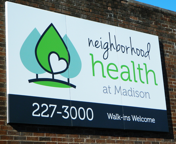
When you have served Middle Tennessee for nearly forty years with convenient, affordable, high quality health care, sometimes you just need a little makeover. Neighborhood Health, formerly known as United Neighborhood Health Services, did just that when they updated the exterior signage at six of their locations. We were fortunate to be part of their transformation!
Here's how it all started. We were contacted by Neighborhood Health to take their new logo and create updated exterior signage. Their combination mark logo has a very clean look, and the pop of green adds just enough color to grab the attention of a passerby. We were able to stick with a white background for most of the signs, but we did use a contrasting black background at times to really make the phone numbers and 'Walk-ins Welcome' stand out. (No, you don't need an appointment, and they accept most insurance and TennCare plans!)
 This 126"x42" pan sign is comprised of three separate panels!
The white aluminum pan faces have 2" returns on all edges.
The signs were digitally printed on 3M IJ35 with an Oraguard matte laminate.
We make new signs pretty often, but this project brought a little extra excitement with it because of the multiple locations involved. Since each facility layout is a little different, we treated each one as a separate project. We fabricated many types of signage, including pan signs, a post and panel sign, exterior dimensional letters and a lighted pan sign. Our lobby was filled with various Neighborhood Health designs when it was time to start the installations!
 The Madison location also added a post and panel sign with the new logo.

It's nice to branch out from typical signage shapes!
We digitally printed and laminated the logo for Edgehill and then installed it on
router cut ACP in the shape of a triangle to match the shape on the building face.
 We used 3/8" thick laser cut acrylic letters in gloss black for the Edgehill location.
We mounted a template on the building (photo on the left) to ensure that the letters were aligned and spaced properly!

The pan signs for Napier Place truly stand out on the building!
These photos show just a few of the installations we did for the Middle Tennessee locations. Speaking of installations, we always hope that they go just as planned. We did arrive at one location to find a small obstacle...with that obstacle being a filming crew! We had to sneak in our installation before the hit ABC show Nashville began filming. Luckily, everything worked out for all parties involved. Who knows - maybe you can see us in the background of one of the upcoming shows!
We think Neighborhood Health has a very fresh and fab new look! We are happy to work with an organization that does so much good for our local community. With eleven locations in Middle Tennessee, your bound to see one of our signs somewhere!
Looking for your own exterior signage? Is it time to freshen your look? We are here to help you get started on your project! From design to fabrication to installation, we've got you covered.


Leave a Reply