Does your New Year's resolution involve any of these words: healthy, superfood, detox, cleanse, fruits and vegetables? If so, you will definitely love reading about the location of our latest Project of the Week! The Urban Juicer is a fresh juice and smoothie bar located in a renovated bungalow on Eighth Avenue South in Nashville. They also have a spot in the Green Hills YMCA, which is one of their original locations. The Urban Juicer first gained popularity after having satellite juice bars in both the Green Hills and Bellevue YMCA locations. With the success of the juice bars, the bungalow off Eighth was transformed into a freestanding location that opened in 2013.

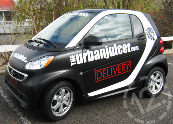
Our Project of the Week isn't about this cute little Smart Car, but we did
wrap it for The Urban Juicer. Isn't it adorable?
The Urban Juicer menu features cold-pressed juices, frushies (healthy fruit slushies), smoothies, salads, wraps and snacks. Before going for the first time, a visit to their website is a must. The selection can be overwhelming, and the website does a nice job of listing the ingredients and (usually) a fabulous description of the benefits and perks of each menu item. With selections such as The Well Being, The Cold Buster, The Liver Lover, The Miracle Worker and The Fountain of Youth, take some time to browse all of the options before you go!
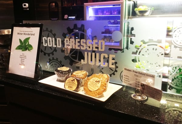
Our team at 12-Point has had the privilege of working with The Urban Juicer since 2012 - when it all began. From vehicle wraps to signage, we always enjoy creating new projects with them. For this latest project, we installed vinyl lettering and graphics to the clear splash guards in the building. We also replaced some vinyl on the front door and installed new vinyl graphics on the door leading into their kitchen.

The vinyl was placed on the first surface (or front) of the splash guard - closer to the baked goods and customers. This allows for easy clean-up of any messes on the back surface. You know, creating wonderful cold-pressed juices and smoothies can get kind of messy!
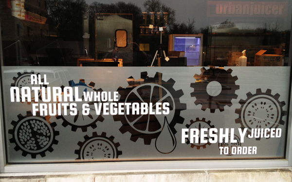
For the graphics, we used a design that we originally created for the exterior windows of the building back in 2013. By using the same design, which incorporates the theme of The Urban Juicer logo, we create a unified look throughout the shop.

We installed the vinyl graphics and lettering on this exterior window waaay back in 2013.
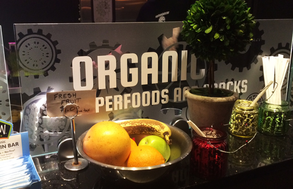
To get the look on the inside, we installed the frosted etched vinyl across the first surface (or front side) of the clear splash guards, which were already located in the shop. We then applied the white vinyl lettering on top of the frosted vinyl. The addition of the vinyl allows the shop to advertise more, expand the use of their logo, and also cover up any messes or spray caused by the creation of their wonderful juices and smoothies. By keeping the vinyl on the front of the guards, the team at The Urban Juicer can easily clean the splash guards without worrying about scratching, damaging or interfering with the vinyl.

Another shot of the vinyl graphics and lettering we installed on one of the splash guards.
For the doors, we had two separate missions. We replaced the vinyl lettering on the front door, which provides the hours of operation. On the inside of the shop, we continued the use of the logo theme by placing the frosted etched vinyl design on the window of the door leading into the kitchen. Adding the new vinyl around the inside of the shop really looks great! We love when style, function and healthy juices come together.
If your New Year's resolution includes something healthy, here is an offer that may be just what you need. For a limited time, you can get a 3-day juice cleanse package from The Urban Juicer for just $75 at StyleBlueprint.
If your New Year's resolution doesn't include something healthy :) but you would like to create a new look for your business or home, contact us today for a free consultation and quote!


Leave a Reply