Your brand's image is a vital component of your marketing strategy to attract and retain your targeted audience. A refreshed brand communicates to customers that your company or organization is putting effort into staying up to date with their needs and industry demands. Since we opened our doors in 2009, we have been fortunate to work with small and large companies willing to take their businesses to the next level. Check out our latest branding project with Cushman & Wakefield as we refresh two entrance monument signs for one of their commercial properties— the Dover Centre at Cool Springs.
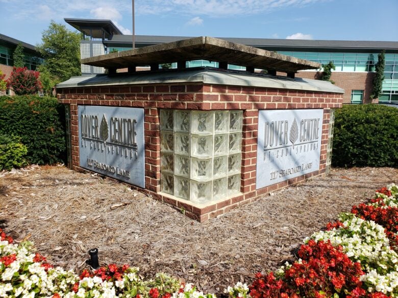 This is the previous look of The Dover Centre’s monument signs. Keep reading to see the amazing transformation!
The Dover Centre at Cool Springs is an award-winning Class A office campus that provides a comfortable and appealing work environment for every corporation it houses. For a steller facility like this, we were thrilled to help Cushman & Wakefield continue the property's branding success.
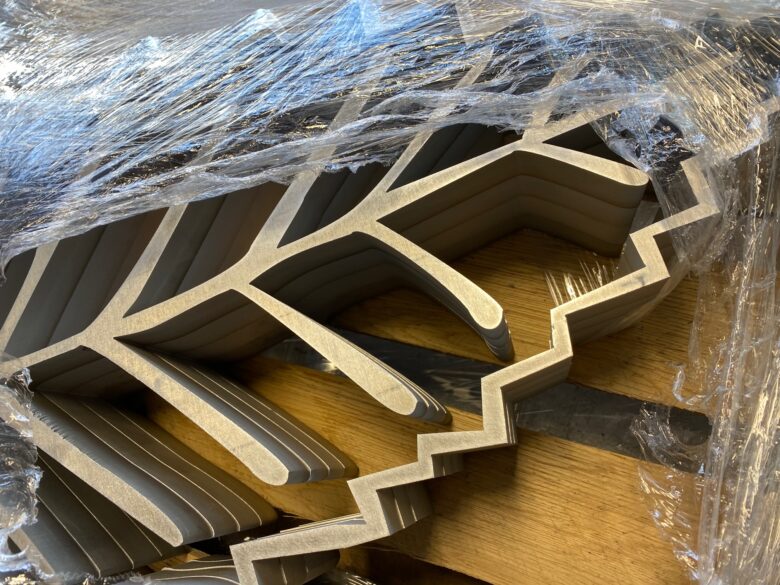 When we say dimensional, we mean it! Check out this close-up shot of the aluminum leaf logos prepared for assembly to the sign faces.
The newly designed V-shaped monument signs received new architectural panels that our production team painted two tones of gray to replicate The Dover Centre's painted exterior.
We also fabricated dimensional aluminum lettering that spells out The Dover Centre's name, leaf logo, and address numerals.
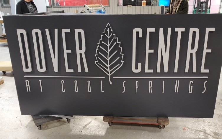 We painted the dimensional letters and leaf logo metallic silver, which stands out against the dark gray back panel.
Before installing the refreshed monument sign structures, our 12-Point team pressure washed the monument structures to brighten up the exposed brick and concrete and also repainted the metal caps.
We then attached the refreshed architectural panels to the brick and glass structures using hidden attachment points.
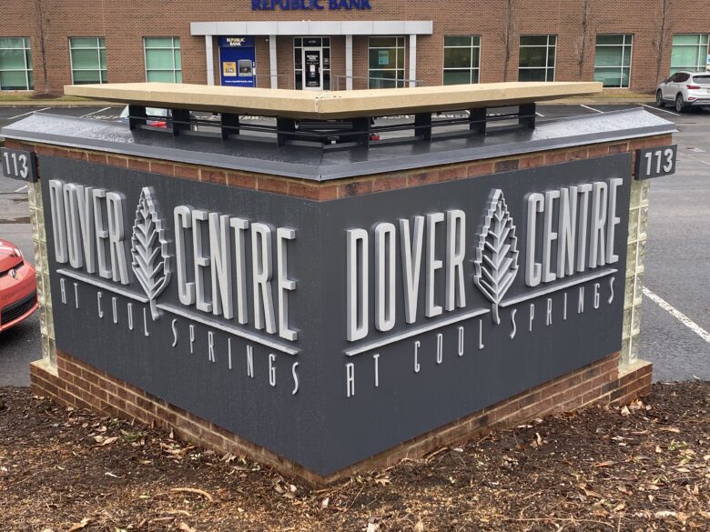 Unlike the previous design, the architectural display extends around the entire V-shaped monument. The larger format is a huge help for visitors to spot either the 113 or 117 entrance location.
The address numerals were added to the monument structure on separate, smaller panels to help create an even coverage of the brick underneath.
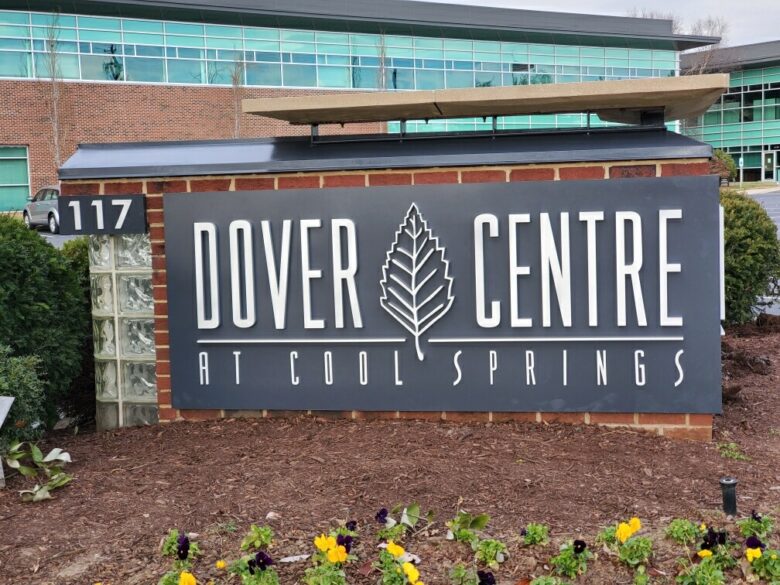 We want to thank Cushman & Wakefield once again for working with us to create these beautiful, refreshed monument signs.
The results of this branding project came out AMAZING! The bold look of the refreshed monument signs complements The Dover Centre's exterior experiential design well. We hope the new entrance monuments help boost the property's architectural achievements.
Are you planning and strategizing ways to refresh or rebrand your company's image? If the answer is yes, we understand the overwhelming feeling you may have about the process and how to get started.
However, WE'RE HERE TO HELP! Our 12-Point team is made up of elite branding experts whose skills excel in experiential branding graphics, vehicle advertising, lobby & logo signage, architectural signage, and MUCH MORE!
Give us a call today at 615-595-6564 or click the link below to get started. We look forward to working with you!
We serve all of Middle Tennessee and ship and install our custom products in locations throughout the US and Canada.


Leave a Reply