Last week, we introduced the experiential graphics and custom branding project we completed with NewGround for the Neches Federal Credit Union. The focus on this financial institution's history starts right when you walk through the door. History, community, family. The phrase was a common theme throughout the project. You'll see it as we pick back up on our tour of the Neches Federal Credit Union in this installment of our Project of the Week.
 Carried throughout the Magnolia Administration branch, the brand colors used in the mural set the tone for the project.
First Impressions
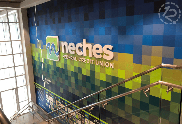
The impact that the history wall mural makes when people walk in is a lasting one. Its pixelated hues of blues and greens provide a soothing aesthetic that you'll see throughout the building.
Beyond that is the teller wall with an identical but smaller version of the same logo on the mural. The logomark on the teller wall measures only 2’-4" square, the "neches" just 11" tall, and the "FEDERAL CREDIT UNION" measures at just 3.5". While we can't take credit for the back wall, the texture of the brush strokes and lighting frame the logo beautifully.
 Vibrant brand colors of the dimensional logo against the muted texture-painted wall provide an excellent backdrop for the bank's tellers.
Turning a Negative into a Positive
The cohesive branding you see in the lobby doesn't stop even after moving out of the typical customer-facing areas. That's the beauty of experiential graphics. They help foster a sense of community between the customers and the employees. A perfect example of this is in their collections department, where that relationship is often tested.
Here we applied contour-cut vinyl printed with alternating images of the community to a base layer of painted drywall. We used the same blue and green brand colors seen throughout the credit union as dividing marks between the images. In addition to a 24" square logo mark, flush-mounted to the wall in 7" painted acrylic is the recurring theme behind this project's design, the driving force behind Neches Federal Credit Union: "FAMILY, FRIENDS, COMMUNITY." That type of relationship between customer and employee brings peace of mind in more ways than one.
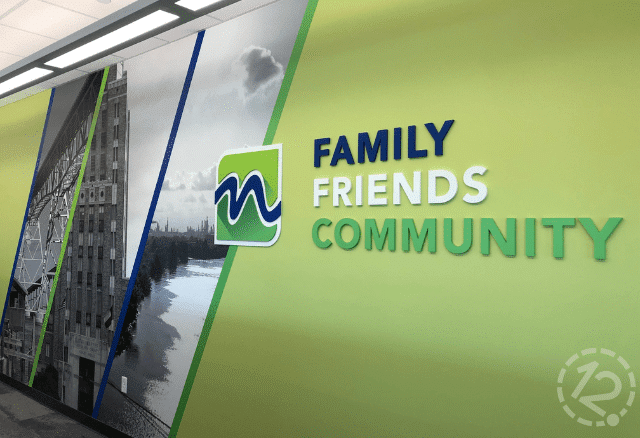 The brand colors with community images in the collections department subtly remind customers and employees that we're in this together. The dimensional lettering quite literally just spells it out.
And somehow, we still haven't finished talking about the rest of this custom branding experience that extends behind the scenes. But we'll tell you all about it in the next (and we promise the final) installment of our Neches Federal Credit Union Project of the Week.
If you're interested in making an impact throughout your workplace, give us a call or send us a message today!


Leave a Reply