When you see popular chain restaurants or retail stores, they’re easily identified through a multi-media mix of cohesive signage. That’s what we’ve been doing with Learning Zone Child Care since our partnership began back in March of 2021. They have several locations across Murfreesboro and around Nashville (with more to come!), and we’ve had the pleasure of working on four of them so far. Gallatin was first, followed by Lebanon and Smyrna in July this year, and we completed Mt Juliet in October. Take a look at how we used the Learning Zone’s brand colors of orange, black, and gray in various forms of signage throughout each location.
Monument Sign Panels
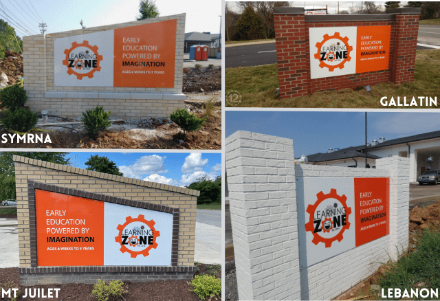
One of the first things people notice about a business is its exterior signage, and the Learning Zone isn’t any different. We used existing brick monument signs and applied panels with their digitally printed logo in their recognizable brand colors.
Quote Signage
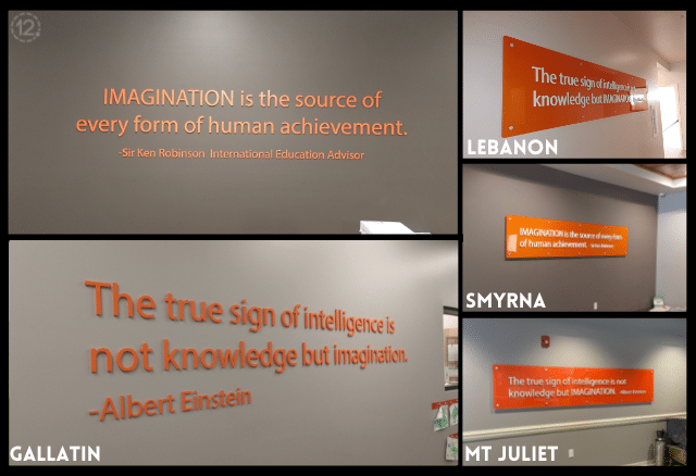
Another common theme throughout the Learning Zone locations is the quotes.
“The true sign of intelligence is not knowledge but imagination.”
- Albert Einstein
“Imagination is the source of every form of human achievement.”
- Sir Ken Robinson, International Education Advisor
While all four feature the same two quotes, the Gallatin location is slightly different than the others. For Gallatin, the quotes are orange-painted acrylic lettering applied directly to the wall while the Lebanon, Mt Juliet, and Smyrna locations’ have white acrylic lettering attached to an orange acrylic panel.
Lobby Signage
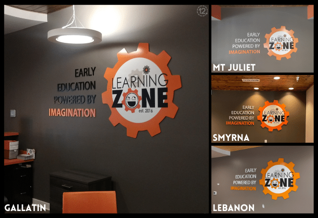
The Learning Zone’s appreciation for the imagination is continued in the signage we created for their lobbies.
Frosted Vinyl Graphics
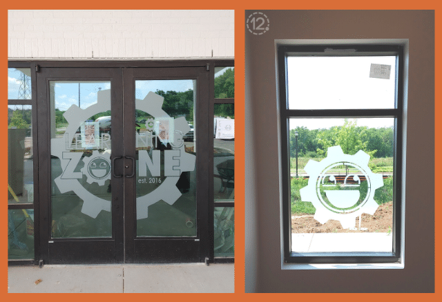
We also used frosted vinyl logo graphics on the entryway doors at all four locations. On all but the Gallatin location, we also applied additional vinyl lettering with hours and other pertinent information. The Lebanon location was lucky enough to get an additional custom window graphic for their hall window.
Learning Model Displays
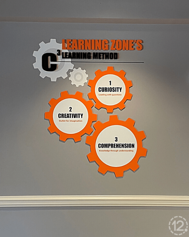
We used their branding and learning methods to create a display showcasing their approach to education. The Learning Zone’s Learning Method is comprised of the Three Cs:
Curiosity - Leading with Questions
Creativity - Outlet for Imagination
Comprehension - Knowledge through Understanding
The gear design used in the learning model display is in the exterior signage, frosted vinyl entryway graphics, and throughout the facilities in staff and classroom identifiers. It’s also prominent on their website and social media. The cohesive branding ensures the Learning Zone is recognizable no matter your location.
If your business has multiple locations or satellite offices, we can create a cohesive signage package to boost your brand’s identity. Give us a call or send a message today!


Leave a Reply