Environmental graphics set the tone, or environment, for a location. Our latest featured project did just that for an entire section of the Loews Vanderbilt Hotel. We worked on a section typically referred to as the 'back of house' - the place that goes unseen to the guests and visitors entering and interacting within the hotel. Loews doesn't look at it that way. To them, it's the 'Heart of House' because it's the core of their business. Everything that it takes to run the hotel happens in the Heart of House, and we had the pleasure of turning it into something extra special for their amazing team.
Located on West End Avenue, across from Vanderbilt University, Loews provides luxurious comfort and accommodations with a touch of Southern hospitality. With renovated guestrooms, fine dining, and space for your most anticipated event, it seems fitting that the hotel would strive to provide their employees with a lively, cheerful work environment. So bring on the environmental graphics!
It doesn't get more Southern than a 'Welcome Y'all'! The Loews project consisted of digitally printed graphics installed on a combination of drywall, doors, glass, and textured surfaces (painted concrete).
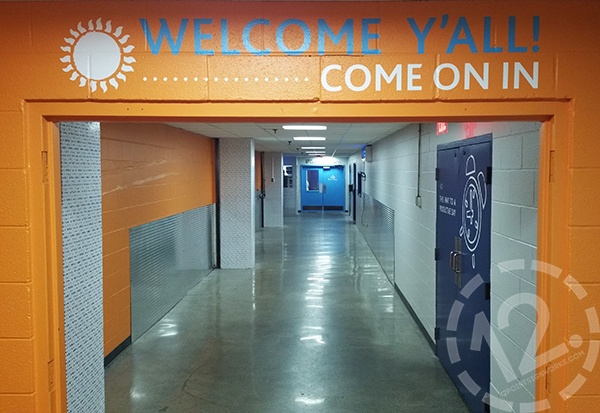
In this photo, you can see the new vinyl graphics on the textured surface above the doorway, graphics on the closed doors (right), and wall graphics on the columns down the length of the hallway (left). At the very far end of the hallway, you can see a white vinyl 'Heart of House' logo contour-cut and installed on the blue door.
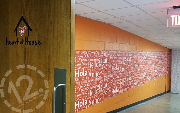
The door above provides a better view of the 'Heart of House' logo, and the 'Hello' wall mural recognizes the people from all over the world who make up the Loews family by displaying the word in many native languages.
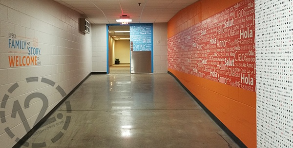
Quotes can be found throughout the Heart of House area, including the one shown on the left in the photo above. The door also features 'Thank You' half-door wraps with the words appearing in languages from around the world.
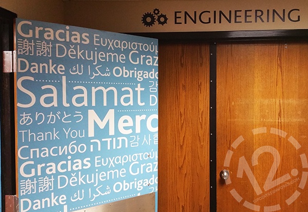
All departments in the Heart of House have their own personalized graphics that also help with wayfinding.
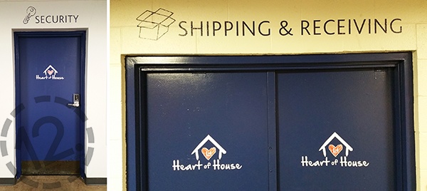
A glimpse of the doors leading to the Security and Shipping & Receiving areas. Each has cut vinyl graphics above the entrance area and Heart of House logos on the face of the doors.

Housekeeping has wall murals, window graphics, and textured surface graphics. They also have one of my favorite motivational sayings: Throw kindness around like confetti.
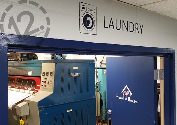
See how each department has their own little brandmark? You can see gears, keys, boxes, and now a cute washer for the laundry area.
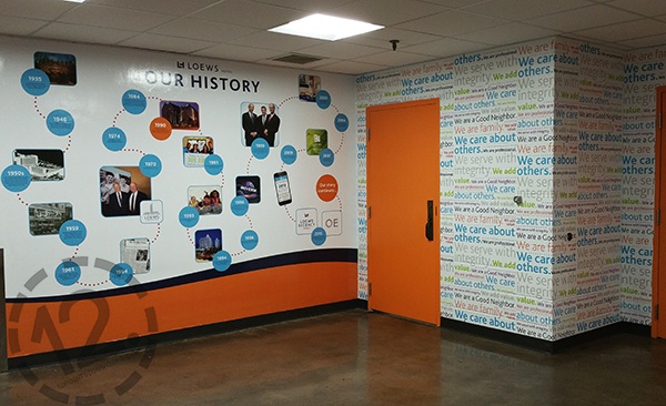
One special area in the Heart of House has a wall dedicated to the history of Loews. Loews Design created the timeline below to show the history of the hotel brand leading into the development and story of the Nashville property. The bright colors and flow of the timeline really pop on the wall and make a truly personalized space for Loews Vanderbilt.
Outside of the Human Resources area, we created custom frame designs out of 1/8" white PVC. We hand cut the material into unique shapes and installed them on the painted textured wall outside of the HR entrance. Team HR can use the frames to highlight important events, department information, or details about stellar employees.

Each of the eight frames shown above has a different design and color scheme, making it a more lively area for staff to stay up-to-date.
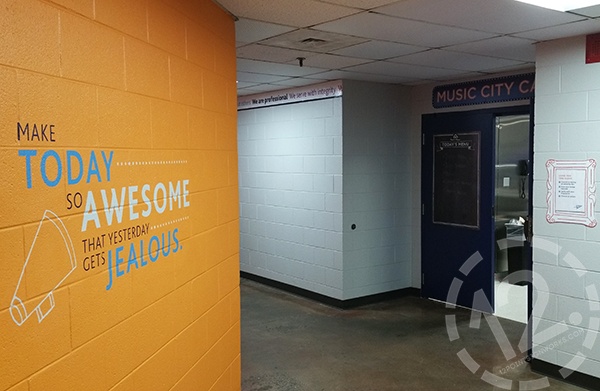
You can see a little glimpse of a graphic border and custom frame we fabricated and installed outside of the Music City Cafe. We also designed a 26" by 40" 'Today's Menu' sign panel that hangs on the door to the cafe. The photo above shows another one of the quotes I love from the project.
When you are planning your business branding, don't forget the elevators! We digitally printed, cut, and installed the custom graphics for the elevators on the Ground and Mezzanine levels of the Heart of House. We also added the same design to the elevator doors across from Housekeeping.
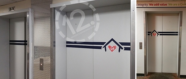
Elevator branding can consist of full coverage vinyl wraps or simple vinyl graphics.
Throughout this entire branding project, it was obvious that Loews wanted to honor their team and bring them together. They recognize the value of the departments that make every aspect of the hotel tick - better known as the Heart of House. To represent their team as a family, they wanted a map that provides a visual of the hometown locations for every employee.
The map was created using dye-sublimation printing on a piece of fabric. The fabric was applied to a cork surface that holds the push pins used to designate the hometown locations around the world. All of the pins that represent an employee have a red string that links it to the pin that represents the Loews Vanderbilt Hotel in Nashville.
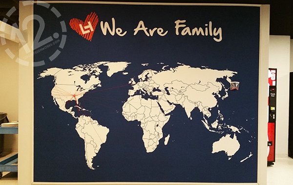
If you look closely, you can see the red strings!
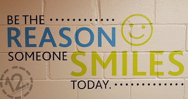
I couldn't resist adding one more motivational quote that can be found in the Heart of House. This message works for everyone: Be the reason someone smiles today. (You can do it!)
From logo branding to positive messages, the environmental graphics around the Loews Vanderbilt Heart of House truly unify and complete the area. We are thrilled that we will be fabricating and installing the Heart of House environmental graphics in approximately 23 Loews properties around the country! Some of the graphics will be the same from property to property, and others, like the Music City Cafe here in Nashville, will be customized to the local area. We are excited about this project and will keep you updated as new locations are complete. Next stop for us: CHICAGO!
If you are interested in this project or in a similar one for your business, please let us know! We are happy to answer questions and get your started on your own environmental graphics that will strengthen your brand and unify your team. Contact us at (615) 595-6564 or by clicking on the link below.


Leave a Reply