About three years ago, we were contacted by Morris Lighting and Sound to help them create a unique logo sign for their facility near downtown Nashville. We designed their logo as an architectural display to compliment the scale of their projects as a premiere audio and lighting provider for tours, live events, houses of worship, healthcare facilities, and corporate spaces. They don't just provide sound and light, they create audio and visual experiences for the likes of Kenny Chesney, Florida Georgia Line, the NHL All-Star Weekend, the CMA Music Festival, Belmont University, and so many more. With a recent change to their logo, they asked us to update the custom signage to reflect their new look.

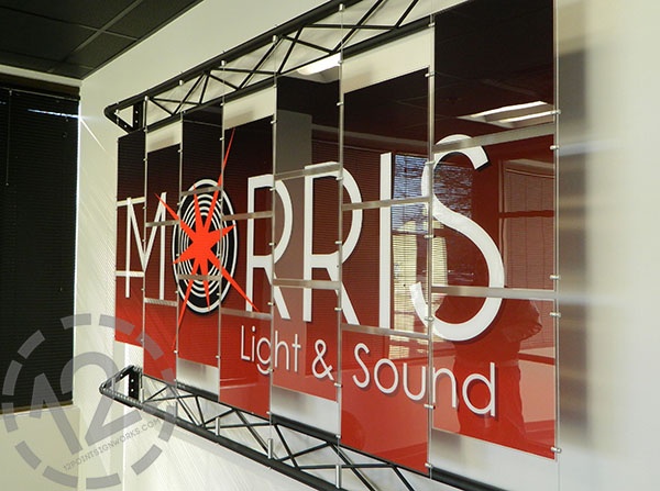
This photo shows the original architectural display we designed, fabricated, and installed for Morris around three years ago. At the time, we added a gradient background to their logo to enhance the signage.
When the Office Manager for Morris contacted us this year, she explained exactly what they had in mind for their new logo sign. It included:
- Keeping the overall look.
- Replacing the 21 panels with the new logo.
- Using a black or dark gray background.
- Taking away the glossy finish on the acrylic panels to reduce the glare on the display.
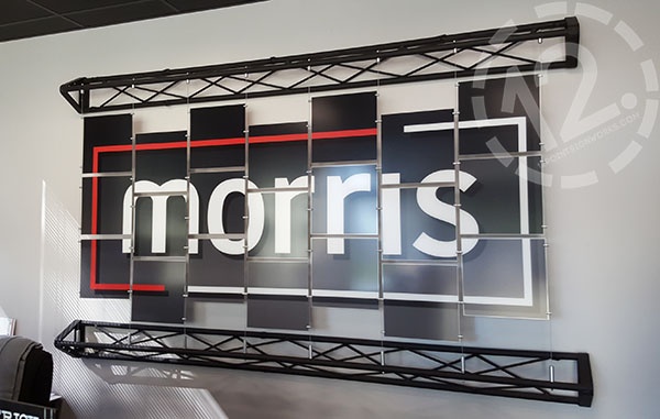
So...we did all of those. We kept the structure intact, which includes eight cable systems and two trusses. To remove the glare, we fabricated new panels out of 1/8" thick non-glare acrylic. We added a black to dark gray gradient (top to bottom) to the background of the new logo and printed the new layout onto the second surface (or back side) of the panels.
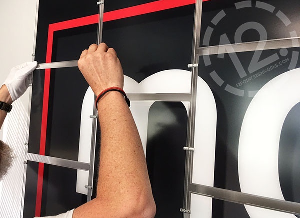
Although the original design offered the flexibility of changing out the graphics over time, we needed to replace each acrylic piece to give the non-glare look that Morris wanted. To do so, we removed each panel and installed a new one, making sure that we lined up the logo to be spaced just right.

Lee carefully replaced the panels by attaching them to the toggle bolts on the cables. The process got the "white glove treatment" to ensure no fingerprints were left on the panels.

The completed architectural display with the new Morris logo! Even though there are spaces between the panels, the lines match perfectly within the display.

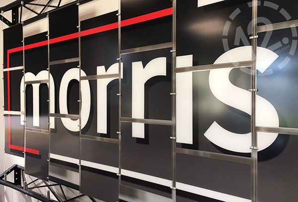
The non-glare acrylic makes such a huge difference! When you compare this photo to the one at the top of the first logo, you can really tell a difference. With the non-glare acrylic, all you see is the logo. It doesn't pick up the pops of light or reflections the way the original did.
This project truly highlights the versatility of architectural displays. We've used them in a number of projects, ranging from company recognition to creative displays in public school cafeterias. Each design is completely unique to the individual or business and, as an extra bonus, changeable!
Looking for your own creative display? We can help! We can modify a project that we've already designed, or we can create something with you from scratch. Contact us at (615) 595-6564 or by clicking on the link below to get started.
We serve all of Middle Tennessee, including Nashville, Brentwood, Franklin, Spring Hill, Murfreesboro, Hendersonville, and more! Not in our area? We also fabricate and ship projects from coast to coast.


Leave a Reply